There are many “right” ways to design an application, so I want to be clear that this is my workflow (and the one I recommend), but it’s not mandatory. I know other designers who just jump right into Photoshop (or code) and produce great work. But if you find yourself having trouble visualizing a design or workflow in your head, give this method a try.
The mental model
The hardest part of designing any application is picturing the entire thing in your head. When you are in the dreaming stage you can plan through an interaction a bunch of different ways, think through all the possible screens, and have fun doing it… except that if you’re like me, you forget things. Often I find myself unable to think through additional interactions since I can’t think that far ahead. For me it’s like trying to think through chess moves three or four moves out. It just makes my head hurt.
My solution is to get it out of my head and onto paper.
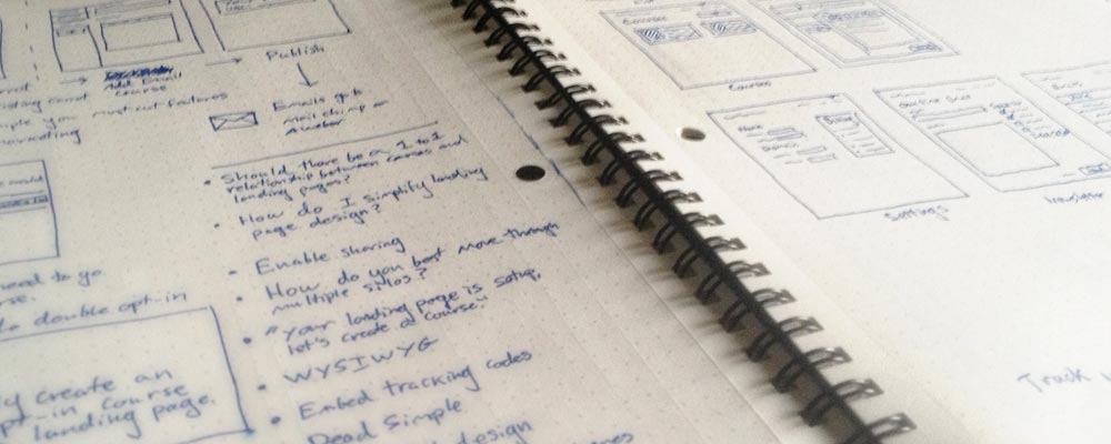
I use either blank sheets of standard printer paper or, lately, the DotGrid book from Behance. Start with regular paper. I don’t want the wait for the perfect tool to arrive to keep you from getting started today.
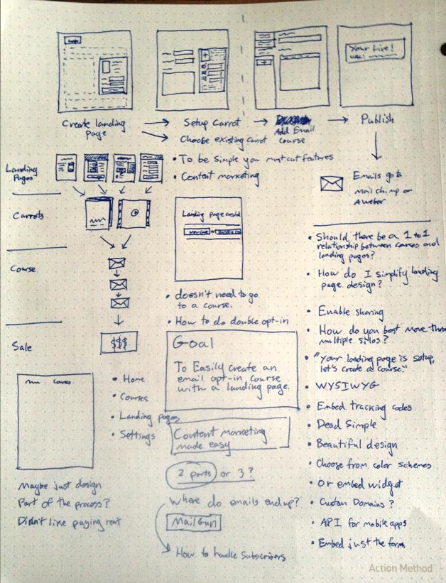
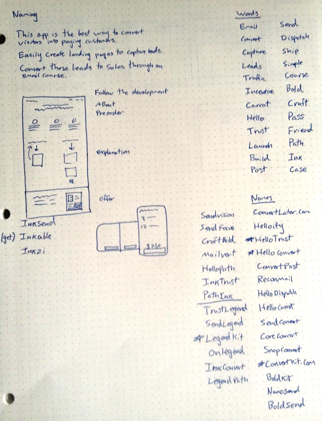
On the right side of the paper I usually make two lists:
The first is a feature list of sorts. For ConvertKit it included Landing Pages, Courses, Settings, etc. The list doesn’t need to be exact, but instead it’s a quick list of what I am thinking of including.
The second is a list of questions to save for later. As you plan out the features and workflow, all kinds of questions will come up. These are important, but also a distraction for the stage of the process you are at. If you stopped to research each one every time, you wouldn’t get anywhere. I write them down so that I can forget them (at least for now). Here are a few of the questions I wrote down for ConvertKit:
- Which email delivery provider should I use?
- How do you support custom domains for landing pages?
- Which rich text editor should be used? Can it be stripped down to just what we need?
- Should there be a one-to-one relationship between Landing Pages and Courses?
At the time I had some ideas about each of these, but certainly didn’t have the answer. To avoid distraction, I saved them for later.
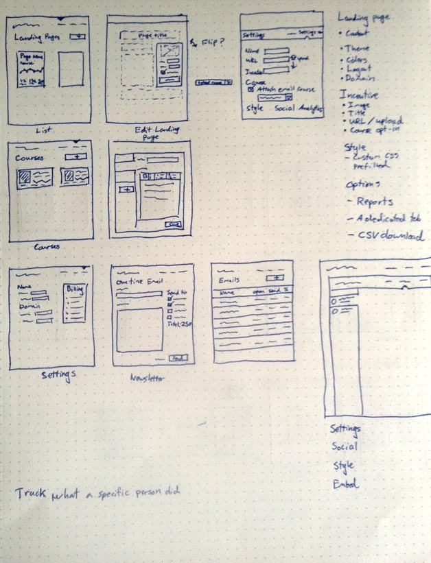
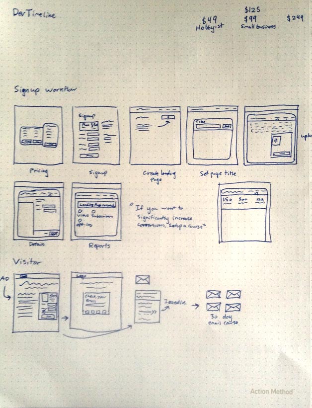
Postage stamps
Next I use the rest of the page, starting in the top left, to draw small postage- stamp-size wireframes. At this point I am just interested in the user flow and main elements. Drawing too large will cause me to focus on the details, which I don’t want to do.
Other designers accomplish the same thing by drawing large wireframes using a marker instead of a pen. The exact implementation comes down to your preference, but the point is to draw at a low resolution.

The Workflow
When I plan out interactions between screens, I think I have everything covered. But inevitably there is something I missed. So until I draw out each screen and step through it in my head, I can’t fill in the missing pieces. Interactions are always simpler when you imagine them.
That’s why it’s important to add every screen to your interaction to make sure you aren’t missing anything. Then complete a task, just pointing at the buttons with your pen. Which button would you click? Where would it take you? Would there be a success message?
Increasing Resolution
Once you have the basic interactions in place and have tried several different iterations, it’s time to make higher-fidelity mockups, where you can actually pay attention to the copy and basic layout, and make sure you have all the elements. You could do this directly in code, use a wire-framing tool like Balsamiq, or a use a design tool like Photoshop or Fireworks. I like to use Photoshop.
These are my first three higher-resolution mockups of the landing page process. First is a list of all the landing pages (showing some basic stats), next is the landing page edit screen, and finally I add the landing page settings.
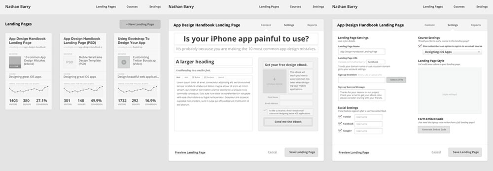
At this stage I can put everything on the page to get a better feel for development time and how I will lay things out. The edit screen stayed largely unchanged throughout the process, but the settings page is radically different. This is mainly because in the version you see here I just put everything on the screen, so it looks incredibly busy.
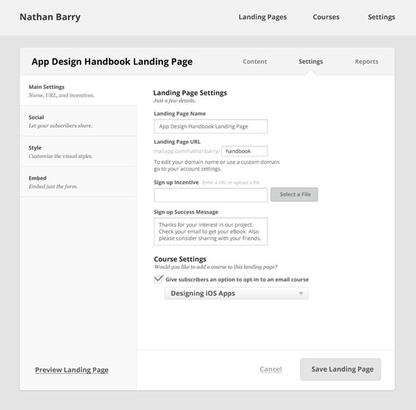
Hiding Complexity
The next step is to take that busy screen and hide the complexity. All those features and settings will be wanted at some point, so I need a design that works well without overwhelming the user.
My solution in this instance is to use tabs down the side to only show some of the features at a time. Most everything is still there (I removed a few features that aren’t needed until later), but it is in a much more manageable format.
Designing Courses
Landing pages are an important part of ConvertKit, but the real magic is in the email courses. Setting up a drip email series is a pain in nearly all email marketing software, so ConvertKit’s core value is in making that process easy. Below is an early iteration of the screen. I imagine I will spend a ton of time reworking and improving it over the next few months.
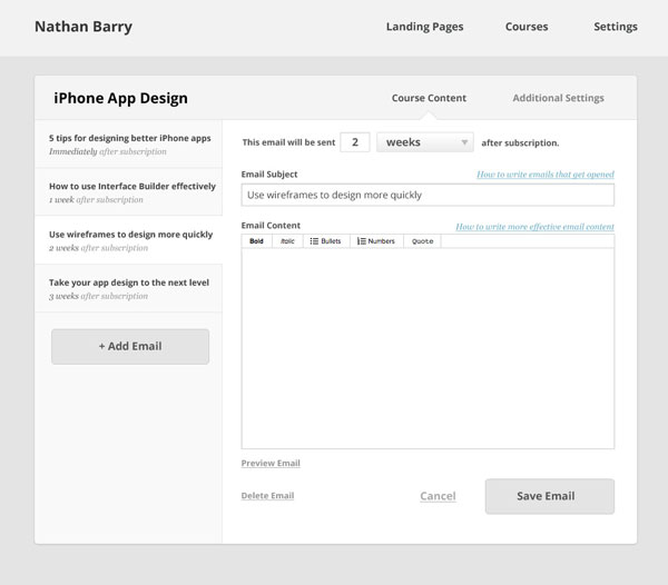
Each email in the course is listed down the side in a tab format. That way it is really easy to think of your course as a series (which it is), rather than clicking in and out of specific emails as you would in MailChimp.
Adding Polish
Taking the course page through to a completed design didn’t require a lot of changes, but one is important enough to discuss. Take a look at the date setting of the email. It reads in a sentence format with two editable values:
“This email will be sent [2] [weeks] after subscription.”
So you can fill in the number [2] and then select days or weeks depending on how you want to schedule your course. Turns out that could be a lot simpler. Since days are a subset of weeks (seven days in a week), we can get rid of that second option and just use days.
“This email will be sent [2] day(s) after subscription.”
This also removes complexity from the list of emails where each one specifies the time since subscription (2 weeks after subscription). If we allow both days or weeks to be entered it becomes a chore to list both options in the sidebar and keep them ordered by send date.
It would be nice to remove the (s) in “day(s)” to fake whether it makes a grammatically correct sentence. The solution I thought of is to use JavaScript to switch from “days” to “day” if the number in the field is 1, but for now it isn’t worth the effort.
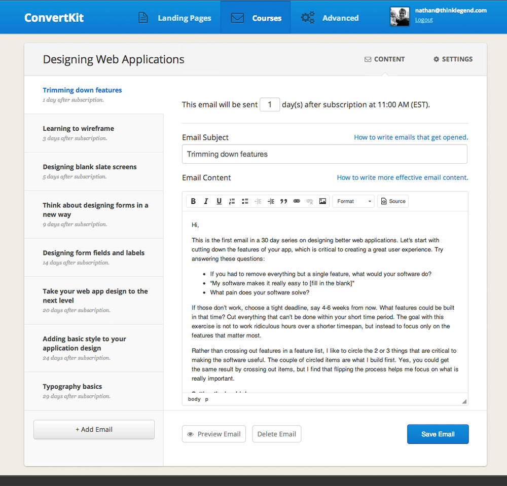
The other details that add a level of polish are basic colors, subtle gradients, icons, and improved typography.
That’s my process. This design is simple enough that I could have skipped directly from a sketch to the coded design, but I think I achieved a better result by completing each step. One shortcut I did use was to define the style (colors and typography) on this page only and just apply it to the other pages in code.
What is your design process? Let me know in the comments.
By the way, if you want to learn much more about creating a great user experience for your application I have an online workshop coming up on March 29th where we can go into these topics in detail. Tickets go on sale March 21st. Stay tuned.


Great tips, as always, Nathan. I’ve found, though, the wireframing process can be challenging for a lot of would-be SaaS entrepreneurs. For those who lack design experience – or don’t feel comfortable creating wireframes themselves – I started a wireframing service: UIWireframes.com
Loved the simplicity on the design, makes me want to create a product just to test your software out. Definitely the email responders on all email softwares is really complex and not easy to the eye. Good job on making this task easier to do.
Excellent information Nathan. I like to use google docs to draw out ideas and processes, this includes wireframing. Makes collaboration a bit easier too.
Your idea about the email pain point is correct. I hope the days of application UI and help/training being so separated are numbered.
I’m going to get Dot Grid Book tonight!
Thanks for sharing this Nathan. I love the clean, crisp style. I do wonder how it feels to actually use though–the hierarchy is slightly confusing to me, at least while just looking at it visually. Perhaps it’d be different when using?
You have the top 3 items in the nav that change the entire page (makes sense).
Then the next level is Content or Settings, with Content being default selected I assume.
With them at the right and the tabs at the left, there’s a bit of a cognitive dissonance for me. Content and Settings determine what you see at left and thus they’re “under” them from a hierarchy point of view, but you see them first and they feel prominent and important…and also change what you see at the right of course.
Perhaps it’s because you have the tabs flowing into the content, so they’re attached….and you also have an arrow under Content, so it feels attached as well?
I mention this because I got into a similar two sets of almost tabs the other day, and I knew it was bad but not how to fix it. Love any thoughts you’d like to share on this.
Hey Nathan, great article and cool to see your mental process when you build things out, and how I could improve mine. I think I tend to be a bit more “cowboy” about just going straight to code.
I actually built a tool that makes mockups/prototypes really easy if you are using Bootstrap. It’s called Jetstrap (http://jetstrap.com/). Still in beta but we are releasing some new stuff soon. We wanted to make it easier for people who are using bootstrap to jump right in to generating UIs, and it seems to be helping lots of people.
Always exiting to gain some insight into the work methods of skilled developers / designers. Appreciate the fact that you share this Nathan.
Cheers! :-)
Great method, i’ll try it for my next project, thanks for sharing.
Hey Nathan,
Like the thought process you go through. Noticed that your “get the course” email form doesn’t seem to do any validation at present. I can press submit and I assume end up having you make a call that you don’t want to make (instead of throwing an error). Unsure if you want to fix that or if it is intended :)
Thanks for sharing your process. I applaud you for your thorough approach while still being honest that things will likely be missed – A critical balance for designers of all levels.
I think a wireframing stage is crucial in larger teams where your user experience designer is often a different person to the final graphic/web designer. Anyone designing straight in code would need to probably step back to take this approach to be able to work for any agency with more than a few people.
I would watch out for your comp design wireframes though. They basically look like black and white final designs. We often have the problem in my agency where someone doing user experience has to deliberately stay away from doing anything remotely attractive in omnigraffle (or programme of choice) to ensure that the designers rethink the interface design while retaining rough positioning and the flow of the user experience. Otherwise we basically get coloured wireframes which is not the point of the user experience design stage. We think of it as more of a requirements gathering piece of work that sets out what has to be on the page in the interface and perhaps possible clever design solutions to primary and secondary interactions.
Also it is often a crucial stage to make quick html prototypes of complex interactions both as a sense check for ourselves (you find problems so much quicker while clicking through and using something) and to make it easier to explain to a client. Sometimes this can just be click through pdfs. So your process I think should be the process people go through as a standard. Its how we and many of our global sized clients work.
This was really helpful because I’m looking to create a product that ConvertKit would be perfect for. Also, wire-framing is a crucial step especially if you need to communicate to other people what you’re looking to do.
Thanks for sharing your process. I definitely saw some valuable tips that I’ll be integrating into my workflow.
Thanks Nathan! It’s so useful to see other people’s wireframe and planning work. It’s hard sometimes to find great information like this on the early stages of web design!
I think that this is a great process. About to attempt it. Great article.