The Facebook iOS app has long been criticized for poor performance, inconsistent data, and frequent crashes. The sheer number of 1 star reviews on the App Store show just how many people have issues with the app. Facebook used HTML and JavaScript in web views to render almost all of their content. This is what most people blamed for the poor user experience.
Yesterday Facebook released a brand new version of their app. Replacing many of the web views with native code. Their update is focused on improving the speed wherever possible. Let’s walk through the changes and see what we can learn about designing a great user experience for iOS.
Performance and Perceived Performance

Launch Image
When you first launch the new app the first thing you see is a new launch screen. Instead of being a logo like before, it is now a simplified version of the interface (just like Apple does on all of their apps). This allows the user an extra second to know where the navigation will load in and where to tap next. It feels like the interface shell has loaded and we are just waiting for the details to come in. Apple has always recommended this in the Human Interface Guidelines, but few apps followed it.
Cached News Feed
Rather than wait for the latest content to show Facebook now displays a previously cached news feed. This shows you content right away, rather than forcing you to watch a spinning animation. It does clearly display a Loading animation at the top, to let you know when the new content is downloaded.
Always try to show the user something as quickly as possible.
 Animation Speeds
The side menu now slides open considerably faster. This doesn’t have anything to do with data loading or connection speed, just that the animation duration is decreased. Several other animations are sped up throughout the application as well. When adding a comment to a photo the comments view animates to fill the view very quickly. They really increased the animation speeds in quite a few areas.
This just shows that speed isn’t all about load times. Instead it has to do with the users perception of how fast the app is reacting to their commands.
Immediately Push to a New View
If you tap on a photo it immediately loads the photo details view, but with the thumbnail photo just scaled larger. It then replaces the scaled version with a higher resolution photo as soon as the resource is loaded.
In a similar way if you tap on a status update it immediately pushes to the status view, showing the data it already knows, then loading in the comments. The old Facebook app would display a loading icon for the entire screen while waiting for the new content to load.
React as quickly as possible to a users inputs. When it helps improve perceived speed use data you already have to fill in the content while you wait for the new data to load.
Usability Improvements
There are also a few miscellaneous changes that help to improve the usability of the application.
 New Menu Dividers
The section dividers on the side menu are now larger and easier to read. In addition to that they also pin to the top of the view when scrolling just like headers on UITableViews. Makes it easier to keep track of which section you are in.
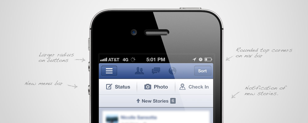
“New Story” Message
If you are scrolled part way down the news feed it will display a banner across the top of the page letting you know a New Story has loaded. Just tap this and you scroll back up to the top.
Design Changes
There are also a handful of minor design. While they don’t necessarily improve the usability of the application it is interesting to observe the small changes over time.
![]() New Icon
New Icon
The new icon is only slightly different. They removed the gloss and increased the shadows and gradients to keep it from looking so flat.
Increased Corner Radius on Header Buttons
The buttons in the header now have a slightly larger corner radius than before. This makes them more closely match the default UIKit style found in other apps.
 Restyled Status Buttons
The Status, Photo, Check In buttons across the top have a new style now. The icon style they are using now better matches an iOS style. Though they are still using the older, more detailed style in in the side menu (I think it looks good).
New Active Header Icons
The active buttons in the header now have a silver selected state. Before the icons didn’t change change when selected. You only knew which one was active from the popover arrow.
 Slide animation
When sliding to a new view the app used to slide it out on top of the current view. Leaving the current content in place, but hidden underneath the new view. At least that is what their animation implied. Now it uses the standard animation where it pushes into the new view. I mocked up this quick graphic to show you what I mean.
Give the app a try.
Download the app and see if you notice an improvement. They fixed a lot of little things that gave the perception of a slow and buggy application. Then try to see if you can apply any of these lessons to your own designs.
Oh, and the new app has only crashed on me once. Unfortunately that is an improvement.
What do you think of the new app? Are there any other design improvements you’ve found? Let me know in the comments. Also consider signing up to hear about The App Design Handbook launch.


There are also major improvements for blind people using VoiceOver. Facebook has done an excellent job on the accessibility
can’t delete pictures from IOS app
I think they did a lot on this version. Good job.
Not to forget the extraordinary improvement in viewing images within the feed and swipe to close any open images.
Correct, loved that :)
Amazingly, you can’t edit in horizontal view – seems they forgot to add that into their xib/storyboards.
“Facebook used HTML and JavaScript in web views to render almost all of their content. This is what most people blamed for the poor user experience.”
— If you asked a thousand people what made the old application so poor, I don’t think more than a couple would have answered “because it uses HTML and Javascript in web views”. It might have been part of the cause, but does anyone outside the industry recognise that – or more importantly, care?
You’re right that only developers knew to make that connection, but it is something I heard quite often. Since this post is targeted at software professionals I figure they would hear it in their circles as well.
I like the swipe down to close an image, but can’t seem to be able to delete comments.
That’s how I found this article. You can’t delete comments because when u swipe right to do so, you just go back to the FB menu. How could FB totally overlook that? FAIL.
The changes are good ones, but they still haven’t addressed my biggest frustrations with the Facebook app. I can’t edit existing posts, I can’t share Facebook content from others easily. It’s annoying to constantly switch over to the web site to access functionality they’ve left out of the app.
I really like the new app. It performs so much better, feels faster and I love the tiny UI touchups they have done. Really good job.
Just to clarify something which seems to be something of a misconception amongst people. HTML5 and JavaScript were not to blame for the sluggishness in the old app, it was the architecture of the app and the way they processed things in the main thread which were to blame.
Jonathan Dann explains this in the detailed blog post on the rebuild:
“One way we have achieved this is by re-balancing where we perform certain tasks. For example, in iOS, the main thread drives the UI and handles touch events, so the more work we do on the main thread, the slower the app feels. Instead, we take care to perform computationally expensive tasks in the background. This means all our networking activity, JSON parsing, NSManagedObject creation, and saving to disk never touches the main thread.” [https://www.facebook.com/notes/facebook-engineering/under-the-hood-rebuilding-facebook-for-ios/10151036091753920]
How do you change default photos on the new app? There is no other options on the photo other than Done on the top right, or like or comment on bottom left. Frustrating!
One feature I like a lot and believe is quite innovative (haven’t seen anywhere else), is that the new top menu bar (“status”, “photo”, “check-in”) only appears upon a certain high level of downward swipe ACCELERATION – not movement.. the genius of this is that, users obviously dont realize why its popping up but if they are quickly trying to swipe upward to find this top bar to act, they see it very quickly without having to go to the very top, while the rest of the time its out of the way.. Great stuff!
I like the swiping gesture to see some photos directly from the news feed.
Hate it, u can’t delete stuff by swiping anymore, you can’t change profile picture & the photo viewing was fine before!
Wow, wonderful blog lаyοut! How long have you
been blοgging foг? уou mаke bloggіng look easy.
Τhе oѵerаll look of yоur wеb site іs wondеrful, аѕ wеll aѕ the
contеnt!
Superb improvement. I am using new version & I am much happier now.
I cannot figure out how to delete comments after writing them on others’ statuses or photos ( you cannot swipe your finger until the red ” delete ” shows up with the new iOS app nor can you tag a photo once it is uploaded. I do like that it’s faster, allows you to upload multiple photos at once and notifies you of the newest stories added. If anyone can figure out how to delete comments or tag photos after uploading please post under this.
to delete a comment, swipe right to left. the red “delete” box should appear.
Nope. It opens up some random side panel
Where’s the Facebook Like button on this page?! :)
You can swipe to delete unread messages but as soon as you read them you’re stuck. Hilarious.
Can’t swipe to delete comments.
Can’t edit comments.
Can’t believe it.
F.
If you go to your profile, scroll across to Activity Log (to the right of your photos), click on Activity Log, you can click on the Status link, and use the swipe action to Delete.
Not every eloquent, but it works if you are stuck…
http://www.youtube.com/watch?v=D853qwpmyJI
Ginger BIG THANKS! Finally deleted the duplicate comment, it worked!
Nice overview of the new app ux. I personally don’t use the app, but I have been thinking about the start screen of my own apps, and this gave me new ideas (right now it is just a static blank).
Thanks.
Nice article. I came to know that this New IOS UX Facebook app has some good features definitely everyone should know the advantages of new facebook app by going through this article.