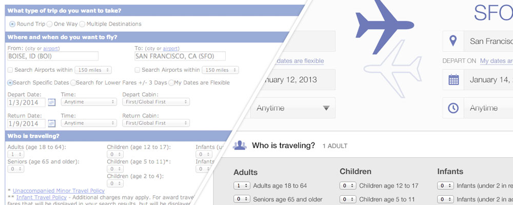
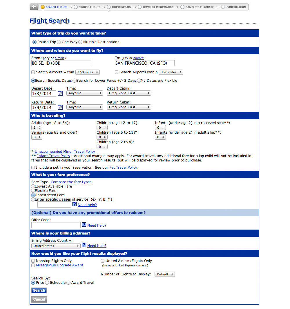
Flying out of Boise, Idaho you don’t have a lot of options. There are only direct flights to a few cities and every itinerary has its downsides. Because of that I spend a lot of time using United’s advanced flight search.
I had two goals in redesigning this screen:
- To know how it could look and function.
- To teach designers how to use Photoshop.
In this post I’ve got a two-part video walking you through the redesign. These videos are the first half of the entire case study available in my upcoming course, Photoshop for Interface Design.
The videos
Part 1
Part 2
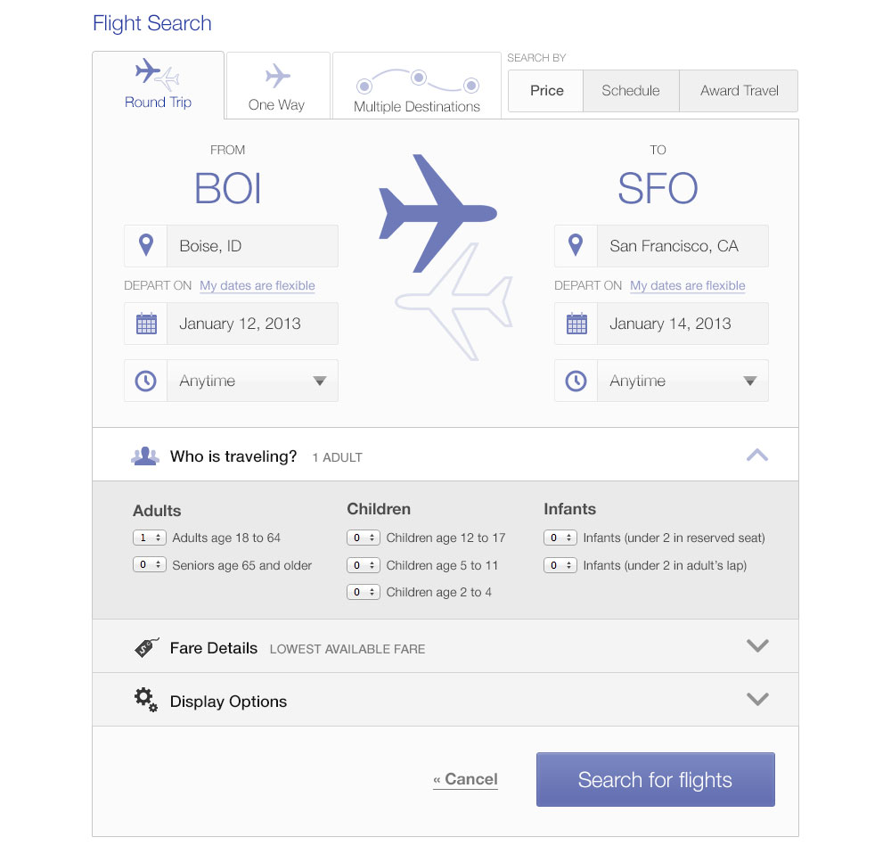
The finished redesign
These videos take you halfway through the case study. The next two are coming next week. To make sure you get those sign up for the email list at the end of this page.
In the mean time, here’s what the final design looks like:
Ready to learn more?
Photoshop for Interface Design is my new course on using Photoshop to design great software. Whether iOS apps, websites, or complex SaaS applications, I’ll teach you the techniques used by professional designers. You can skip right past the Photoshop tutorials for photographers (no red-eye removal tutorials here) and go right to learning about paths, layer styles, and the techniques you’ll use every day.
If you want to learn to use Photoshop—and value your time—this course is for you.
Sign up with the form below to hear more about the course and also get the next installment of this case study.


You definitely improved the aesthetics of the site. Nice job.
This seems like the first step you’d need to take if you want to build really great software.
Hard to believe United skipped this step.
That is really nice, Nathan! You did an excellent job. Just out of curiosity, is there a reason why you left the “Who is traveling” dropdown lists unchanged?
OMW! what a difference!
Thanks, that was fun! Interesting how your selection of shortcuts differ from mine. In the dramatic conclusion, I hope we’ll hear why your trip to SFO was cut short by a day (15 -> 14), hah.
It actually was cut short one day. I was coming home the 15th (in SF now), but then realized I should be home for Valentine’s day. So now I’m flying home early tomorrow morning (the 14th).
Good work. The UI Elements to choose who is traveling could be bigger for touch interfaces.
Really nice walkthrough!
haha…I’m flying out of Boise tomorrow on United, definitely hate jumping through the hoops!
Love the look of your final design!
One thing that might make it even more convenient would be to get rid of the inc/dec buttons. I really hate those thing (I always feel like I’m 7 years old again playing ‘Operation’ with my sister).
Anyhow, I think a series of buttons might be better.
For example, most of these values will most likely be between 1-3. How many infants do people normally travel with? And certainly how many infants are in laps?
I think a series of buttons with one, two, or three figures would work well, and then have an ‘Other’ button for those folks that are booking a field trip for their high school chess club.
Again, looks great.
Cheers! :)
Nice! Suggest changing the text under SFO to “Returns on” as that suggests that this is the return leg of the journey. Also note that you’ve implicitly added a feature. The original screen allows you to be flexible on both departure and return. Now you can be flexible on one or both of the legs.
Having huge BOI/SFO labels seems redundant – I mean it looks cool, sure, but given enough familiarity with the UI (think “expert users”) those things starting to become a sore in the eye. Same for huge picture of airplanes that just repeats what the icon on the tab already communicates.
Holy cow. The United interface is the most unusable, disastrous, and embarrassing work of technology I’ve ever seen.
What makes me most sad though is someone presented this as prod ready and actually thought it was great. Sigh…
Nice, the UI becomes more elegant and easy to understand. Kudos to you.
That’s good videos about Photoshop. Thanks.
Besides the Photoshop part, several things I noted:
1. missing “Search airports with XX miles” option.
2. the big airplanes logo between “FROM” and “TO” seems not useful, and probably make cell phone users inconvenient (need to scroll left and right)?
3. (agree with Art) big BOI/SFO is not helpful. Most people may prefer full city names.
Really nice design.
Looking forward to the Photoshop course.
When do you think it would start?
Nice work Nathan.
One thing I have always noted is that designers unconsciously tend to display the ID prominently. In this case it is BOI and SFO.
Do users really care about the ID of the airport?
I think “Boise, ID” and “San Francisco, CA” should be prominent. San Francisco has SFO, QSF and other airports. I would look to rename that term “San Francisco, CA” to something more specific to identify each airport in San Francisco.
Just my 2 cents :)
– The entire grey field below “Who is travelling” could be replaced by a simple “Add” button.
– Icons look blurry. For a cleaner, crisper result, consider using Adobe Flash instead. Like they say in UX circles, Photoshop for photos and Flash for everything else (Illustrator only if you’re into fine art).
Also, Google “Air traffic flow management”.
Your Photoshop videos have been fantastic, thanks! I hadn’t known about option-dragging effects from element-to-element, using space-bar to adjust your marquee selection, masking effects or layer effects (even though I kept accidentally opening the window when I’d try to rename a layer!)
I’ve already implemented several of your lessons into my workflows! Well worth the watch!
WOW. The redesign looks freaking awesome. #kudos
Great job, you should try the same exercise with Antetype.
http://www.antetype.com/
It’s a much better tool for web design than Photoshop for a bunch of reasons. I might actually take your design and remake it in Antetype if I have an hour of downtime this weekend.
NOTE: I’m not an employee of Antetype, I just love their product SO much!
Could you do me a favor and send me the photoshop file with the assets for the icons? It would save me a bunch of time remaking the design in Antetype. I’ll send you the final product back so you can evaluate the difference (and I’ll make a video if you are curious).
No, sorry. It’s part of my paid course that launches in 1.5 weeks.
@Luca – Sounds like he is not curious!
@Nathan – Do you cover responsive designs in your course? I also like to see a mobile version of this site.
This is so beautiful and serves as a great inspiration for me. Nathan you’re a great inspiration I’m really wowed by your creativity and how you transformed this section of the flight search section. I’m very sure user would find it very soothing and relieving to use. Great work Nathan, thumbs up.
This is what one would say functionality vs aesthetics or when developers take the roles of ux
Great example :) and actually lately I started ready more and more about this issue.
Virgin seem to have nailed this https://www.virginamerica.com/