To get your own copy of Commit for $2.99 on the App Store.
A few years ago I designed an iPhone app called Commit. This little app has made me more money (indirectly) than just about anything else I’ve done. It’s not the app sales (those have totaled about $10k in two years), but instead the habit that Commit has helped me form.
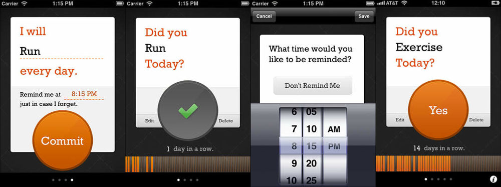
Commit is a habit building app based on Jerry Seinfield’s productivity method. The idea is that if you want to get good at something (like writing jokes) you should do it every day. Keep track of your days in a row to build up a chain, then part of your motivation to complete the task today is to not break your chain of days in a row.
This technique works. I started writing 1,000 words a day in March 2012, by July I had a small streak going that I’ve maintained for over 400 days. You can read more about the process and the massive benefits here.
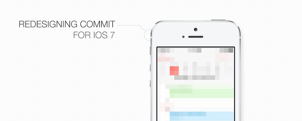
The point of all that is that Commit was long overdue for a redesign. Let’s jump in to my process.
Note: at the end of this post I have a really exciting announcement. Read the whole thing, then sign up for the form.
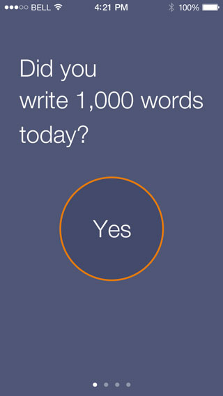
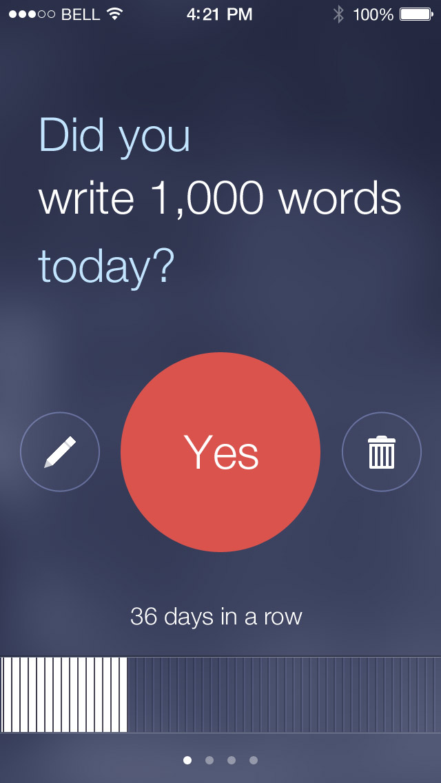
The current design
The current design uses a page view controller like the weather app built in with iOS. This means that you can add multiple commitments and swiping side to side moves between each commitment. Here are a few screenshots:
Inspiration
The first goal was to redesign the app to make it visually match iOS 7, so I started researching other app designs. Since iOS 7 wasn’t out yet, that meant looking at a work in progress designs on Dribbble. You can see the bucket I created for inspiring designs here.
I also spent a lot of time looking at the design pages on Apple’s iOS 7 site. They included screenshots of every app, so I paid close attention to each of the details.
What I saw was a whole lot of white. There’s nothing wrong with that, but nothing inspired me to design Commit to match.
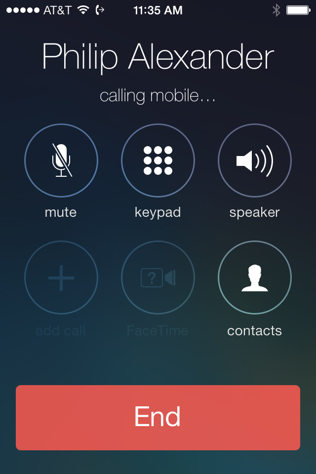
It wasn’t until I installed the iOS 7 beta on my phone and saw this screen that I found a beautifully designed screen I wanted to emulate. The active call screen is really well designed. It’s flat, but not boring. I like the thin lines, high contrast, and subtle background. The first time I saw it I thought, “wow, that’s good design” and took this screenshot:
Then it was time to turn to Photoshop to start designing. I downloaded the iOS 7 Photoshop template from Teehan + Lax and got started. My first attempt didn’t turn out very well.
That direction wasn’t working so I scrapped it. Though whenever I start designing down one path I am hesitant to try an entirely new direction out of fear of losing my current work. My solution is to save a new file so that I can always refer back to the current state. So Commit.psd becomes Commit2.psd and I keep designing without worrying about losing my past work when trying something completely new.
Attempt #2
My next attempt was to match the call screen even more closely. I created a subtle background by taking a stock photo, desaturating it, and blurring it heavily. Then overlaying it on a colored background with some noise and a slight gradient.

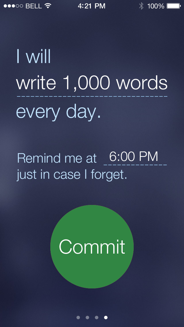
Next I wanted to try to match the default color schemes in iOS 7, so I used the same button color from the end call button combined with some of the other elements from the original version of Commit.
That was starting to turn into something that would work, but with a couple problems. First, the red button made it look too much like a destructive action. Which is not ideal since it is the main button you interact with. Second, the marks for each day at the bottom didn’t seem to match. And I still had the shadow/highlight beveled lines which aren’t really seen in iOS 7.
I wanted to come up with a new way of displaying your chain across the bottom and even turned to pen and paper to come up with something completely new, but without any good results.
Attempt #3
I posted what I had on Dribbble to get some feedback. The feedback was really great, but I especially appreciated Marco Moreno designing a better method for doing the chain. His is really simple, but for some reason I couldn’t think of it when I was stuck.
I also switched to a green button since it seemed more encouraging and reworked the icons. Here’s the third iteration:
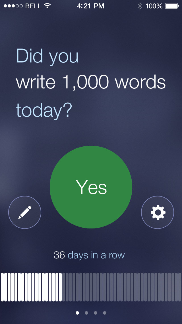
This ended up being the final version of that screen. Another change I made was to move the secondary buttons down so they align with the bottom of the “Yes” button. I just think it looks more interesting.
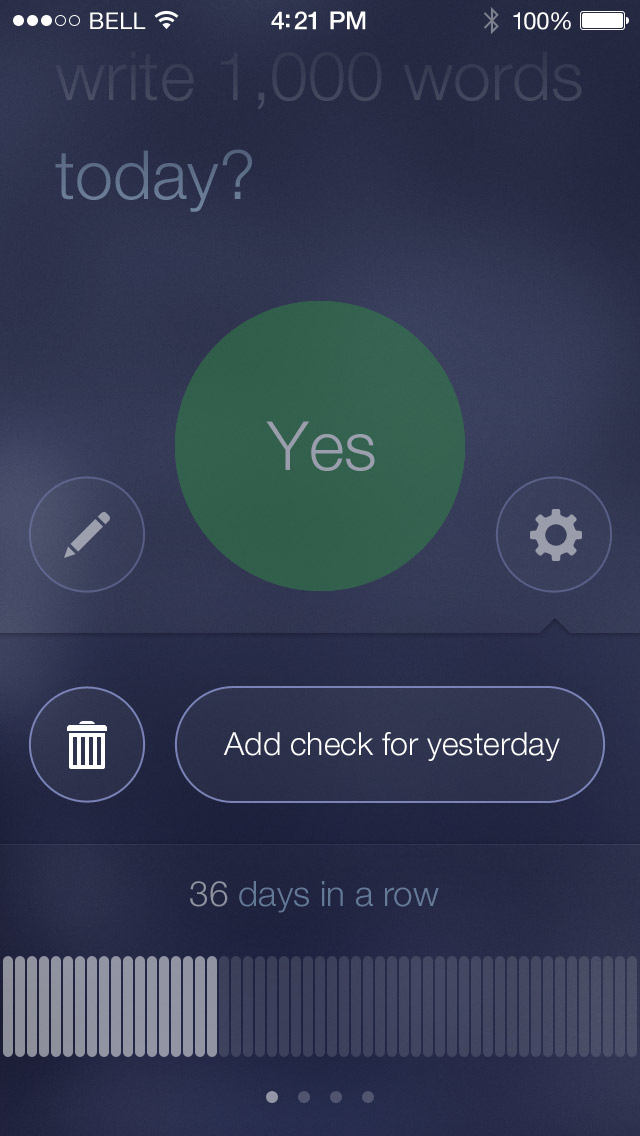
I also realized I needed to change the details view for each commitment. First that meant the delete button needed to be replaced with a settings icon. In the old design the commitment card flipped over to show a few options. Since I ditched the card layout, that no longer made sense.
My solution was to move the two settings buttons into a slide out drawer. It’s simple, but I think it works well:
Designing other screens
Next I needed to design the add commitment screen. The way the Commit is setup this is actually the first screen seen when the app launches. With the rest of the visual style in place this screen went really quickly. I took the same old interface and made it match the new style:
App icon
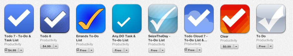
Even for the first version of Commit I really struggled with the app icon. Finding a metaphor for checking off a commitment always had me coming back to a checkmark—just like every other app on the App Store. Seriously, this group is a little crowded:
I really struggled to think of something better.
A good icon usually features the most prominent idea or feature of the application. Ignoring the idea of checking off a commitment for the day, the orange button (in the previous design) was the most prominent. I found it exciting to be able to hit that button once per day, it showed I had accomplished the most important task of the day.
![]()
That worked, but I really don’t think putting the app name on the icon itself is a good idea. I did it then because I was trying so hard to avoid a checkmark… whether right or not.
The new design
There are two design tasks I really dislike: designing logos and designing icons. But whatever you think of the old icon, it doesn’t match the new design, meaning I needed to start this difficult task over again.
This time the prominent idea I wanted to focus on was list of days in a row that you completed the commitment. To me that really is the most important part of the application.
Since that often has gaps in it I thought I could represent a checkmark (see, I’m back to that idea again!) in the negative space. Here are a few attempts to accomplish that.
![]()
You know what that is? Taking a bad idea and trying to turn it into something decent. A few of those are truly awful, but I needed to give the idea enough time to see if it could work (it can’t).
Actual progress
One part of the app I am really happy with is how the rounded corner rectangles look for representing the days (Thanks Marco!). Taking that idea I shrunk them down into little dots and tried to make a checkmark out of that. Here’s that version:
![]()
I actually liked that! …Even though it is a check mark it had some character. In a final attempt to bring it closer to the core idea of Commit, I shaded out some circles to represent missed days in the broken chain. The result is the final icon that I decided to go with:
![]()
Here’s the icon in it’s native environment thanks to Michael Flarup’s App Icon Template:
![]()
Yes, I settled on a checkmark—just like every other app—but I feel it captures the ideas that makes Commit unique. And besides, this icon is green, not blue like all the competition. ;)
An announcement
At the beginning of this post I promised an announcement, so here it is:
I’m releasing the iOS 7 edition of The App Design Handbook on November 6th! At lot has changed in iOS design over the last year since the 1st edition was digitally published, so it’s time for an update. The book will also include brand new video tutorials and interviews with leading designers in the iOS community.
Introducing my co-author
Even more exciting than the new edition is who I am working on it with. After having written three books on my own I wanted to see how much better of a product I could make by working with someone else.
Jeremy Olson is the co-founder of Tapity, an iOS app design company. In 2011 Jeremy won an Apple Design Award for his app Grades. He writes regularly about iOS design and business on the Tapity blog.
Jeremy is an excellent writer and an even better designer. That’s a rare combination and I’m thrilled to be working with him on this new project!
Update: the book is now available! Get your copy here: The App Design Handbook.
Enjoyed the article?
My best content on design, marketing, and business. Delivered each week for free.


New design looks great!
Nathan, when will the redesign launch? Thanks!
I’m not sure yet. Still wrapping up some of the code.
Wow! So awesome to see the thought process behind your work. Which has inspired me to redesign some things!
Grate job Nathan and perfect interpretation, Thanks for sharing.
Great write-up and even better designs! Luv this! Can’t wait to try it.
You’re a great inspiration Nathan. Many thanks for sharing. My website is long overdue for redesign. With this process, I am fired up. Cheers
Good stuff — I really enjoyed the walkthrough.
Thanks for sharing the design process. Looks great!
Thanks for the mention man! Looking forward to getting the update in the store. This is for all the articles coming out saying that feedback is dead on Dribbble. Not true in this case. ;)
Really useful case study, and nice redesign!
You should add a share feature on your blog posts. This is great information and material to share. Thanks!
If one buys commit now, will there be a free upgrade to the new
Version?
Great lookin re-design! I see your initial attempts at the new icon design, where there more at the pen and paper stage or did you jump right in to digital versions?
Thank you for that!
You hate designing logos and I hate writing walkthroughs and tutorials. So thanks for taking the time and effort to share your experience.
Great process & very interesting!
One thought as I use the app. If I’ve gone a number of days without writing, I don’t have any clue how long it’s been, but if probably be more inclined to write if there were some way for me to see how long it’s been. Maybe a carat above or below the rectangle for the day? Or once a day is in the past it gets grayed out so you have an idea of how long it’s been? I love the app. Great work, can’t wait for the redesign
The new design is really amazing!
Thanks Nathan for sharing your ideas with us :)
Great stuff, and I prefer the direction you took far and away above the lot of let’s-make-every-thing-while-add-helvetica-and-some-padding-and-call-it-design approach. Plus, I think I’ll start using Commit!
Could we have an idea of the number of days you spent on this ?
Awesome job Nathan!
I wonder, did you build the UI natively or is HTML-based?
regards
Great and interesting walkthrough of your thoughts. Thank you so much for sharing!
Love how you can pull those design really easy! People need to understand that design matters not just functionality.
Keep it up nathan!
Really nice re-design, looks very clean. I like it.
Interesting how iOS(7) new design forced app developers/designers to conform to the new global style. This has pros and cons, in my opinion.
Awesome! Please update soon :)
Very solid design! I <3 how you explain each step of the process!
Really nice post, Nathan. The redesign looks great, waiting to see it on the app store ..!
Is Commit going to be an update or a new app all together?
An update to the existing app.
Any news on a release date?
I take that as a “No”
I’m not sure yet. Hopefully within a week or two.
Thanks.
Any ETA on the iOS 7 version? Love the app Nathan
It says that its not availsble to buy on the UK iTunes app store anymore. Any ideas?
Apple has removed it from sale. I’m not sure why and their support is not being helpful. :(
Thank you Nathan, This is really great article, I am beginner in visual design world so I am passing through very painful time.
This is really great detailed everything with inspirations. I love this.
Keep it up!