Yesterday I was asked on Twitter if I had any new comments on the new Twitter iPad redesign (since I had studied the Facebook redesign). My first thought was “Redesign? What redesign?” I immediately went to download the update. While waiting for the new version to download I started thinking about all the things I liked about the Twitter iPad app.
Twitter created a great experience for the iPad. It felt new and unique. Setting trends rather than following them. The way the panels stacked on each other made for a quick interface that could have multiple things going on at once. But not in a confusing or cluttered way. I loved that I could continue to browse the tweet feed while links were loading. Using Twitter on the iPad almost made me feel… productive (almost).
Best of all I loved how they made a universal app where the iPad app didn’t feel like an oversized, childish version of the iPhone app.
Excited to see how Twitter improved on this great design, I launched the newly installed update.
WTF!?!
What happened to all the great design interactions I just talked about? The new app does exactly the opposite of what I just mentally complemented Twitter on. It is their iPhone app, blown up and made child sized. The extra screen real estate on the iPad is just used to make fonts larger. Nothing more. This looks like a case of prioritizing development effort over the user experience. Since I’m sure much more code can now be shared between the iPhone and iPad versions.
Now, we should take a step back and acknowledge something very important. I wasn’t on the design team. Neither were you. Smart people designed this app and I’m sure they had their reasons for every design decision made. Not being in those meetings I don’t know the justification, I can only see the end result. With that in mind, let’s get back to my opinion.
So what changed?
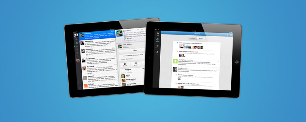
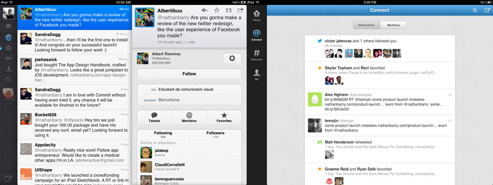
Time for a quick tour through the app. Just for fun I put the main screens of the two apps side-by-side. Old on the left, new on the right.
The Good
Let’s start with the good. Generally I like the clean feel of the app, each tweet is showcased well, they just do it at the cost of user experience. I think if I never saw the previous version I would think this was fine.
Colors
The matching color scheme looks great. The light grey and blue work really well together. Branding the app, but not being in-your-face about it. This is the sort of thing you want to make your iPhone and iPad apps feel consistent.
Tweet Details
I like being able to tap a tweet and have it animate larger right in place. That let’s me see any related media, the @replies, and gives access to actions related to the tweet. The animation is nice and snappy. A second tap puts it back at the small size in the list. This is a case where they could have opened the tweet in a modal, but what they chose works so much better.
Web Browser
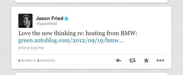
I love the way the grey/silver bar on the web browser looks. Clean and simple. My only complaint is that the back button is awfully close to the close button. I often hit close when I meant to hit back.
Direct Messages
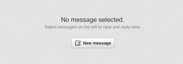
The messages interface borrows heavily from existing iOS styles, which is great! It looks really nice and is intuitive to use. Also the blank slate message is well done. Pay close attention to blank slate messages in your apps. A simple message and a single action do wonders to improve usability.
The Bad
Most of my complaints come down to the fact that this feels like an oversized iPhone app. The extra space just isn’t used in a productive way. I can’t stress this enough to new designers: you don’t need to copy your iPhone interface for your iPad app. Design each experience to be the best for the device.
Menu
The new app has exactly the same menu as the iPhone version. 4 simple icons with text labels. The labels are an improvement as it can sometimes be hard to know what the icons mean on the old app. But really you can just tap on them and figured it out quickly. The iPad has so much space it seems odd to squish all the content into only 4 menu items (down from 6 in the previous app).
Empty space or white space?
A common mistake made by new designers is to cram too much information into a design. Effectively using up every bit of space and not having any white space between elements. This makes an interface feel cluttered and overpowering. This doesn’t mean that more space is always better. There is a difference between white space (as a design element) and empty space (large, unused portions of your canvas).
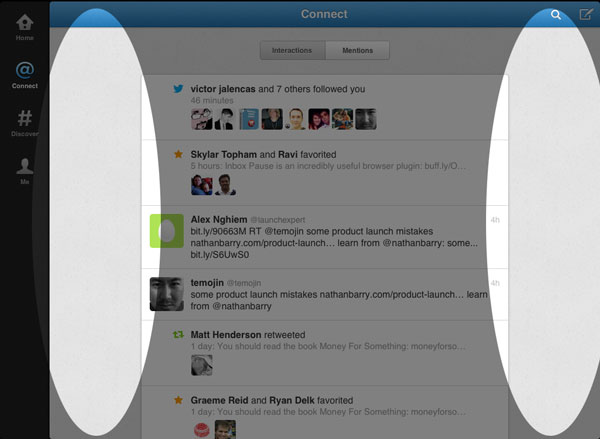
Now to be fair this only appears in the landscape orientation (which I use most commonly). In portrait this space is taken up from the narrower screen. With the stacked panels on the previous version this was never an issue. I could display only the tweet list, or I could view the tweets and a website at the same time. And it worked really well. Such a shame to get rid of it.
Transitions
Anytime you do a full screen transition on the iPad it is going to feel slow. Animating a new view across the 1024 point interface takes time. Instead it is better, for smaller amounts of content, to just animate a portion of the view. Like the new app does to display the details of a tweet. Just animating the part that needs to change is great for the iPad.
In most cases the new version does a full screen transition to the new content. This is a minor thing, but it feels slow and helps dull the overall app experience.
Messages Menu
How do you access messages in the new app? Not in the giant menu on the side that has plenty of space, but instead you have to tap “Me” and then the small email icon on the right side. This then brings up a full screen modal. Why? The only reason I can think of is to keep it similar to the iPhone app.
If you get nothing else from this review, remember that this is not the way to build consistency between your apps.
Title Alignment
Since the title bar is centered inside the main view, but the clock is centered on the iPad screen, they appear misaligned. It is obvious that each one is centered inside its respective container, but they are just close enough to each other to feel misaligned.

Tweet Replies
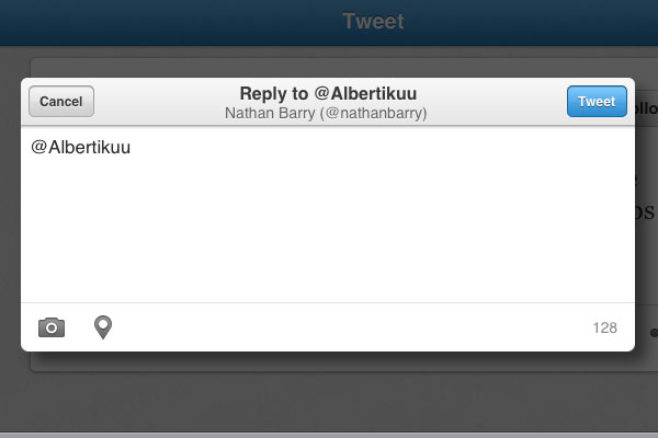
When I go to reply to a tweet this little reply box comes up in a modal. But what is it sitting on top of? Oh, that’s right, the tweet I am replying too. So I have to close out of my reply in order to read the original tweet. That’s just bad design.
The Conclusion
I don’t want to be the person who always screams for the old design, but I really don’t think this is an improvement. By prioritizing developer convenience over user experience they have taken a huge step backward. This just shows how careful you should be when redesigning from scratch. Instead it is usually better to iterate on an existing design rather than throw it away and start over.
In time I may get used to the app, but it seems a shame that so much great interaction design was wasted.


I couldn’t agree more. It also makes me sad that they are limiting 3rd party developers when they go and do this. I’ll hold on to Tweetbot for as long as I can.
The charger conjointly has 2 USB ports that mean if you have 2 devices in want of charging, you will not want to watch forr one in order to
complete. This is surely an eight-signal, reversible connector that’s capable of
transferring data and charging the handset even quicker than
before. are dozens and dozens of accessories manufactured
for use with it.