You care about designing good software. How do you do that? You can read books about user experience and design, but at some point you have to actually start designing the interface. More than just how the software or website functions and how you interact with it, but what it actually looks like.
There are plenty of tools. Many people even design directly in the browser. But the vast majority of professional designers use Adobe Photoshop. Now with Adobe’s new Creative Cloud pricing you can get the entire Creative Suite for $50/month or less (what you’d pay for any SaaS app). So you’ve selected Photoshop, it’s cheaper than ever to buy, but… how do you use it?
Searching for Photoshop tutorials will teach you how to turn photos black and white, remove red-eye, and improve your photography workflow. But, wait… You aren’t a photographer. You just care about designing great software.
It turns out Photoshop is used by several distinctly different groups of people including photographers and interface designers. Unfortunately, all the beginner tutorials are for photographers. I want to help you skip past all the tools you won’t use and jump straight into the tools and techniques actually used to design interfaces.
Ready?
Layers and Groups
You can’t use Photoshop effectively without understanding layers. Only beginners put multiple design elements on the same layer. Here’s how layers work.
In school, did you ever see those anatomy textbooks that used different layers of transparencies so that you could flip through different parts of the human body? Each page would have just a few parts on it, but they would all stack together to form the complete image. This means you could look at everything all at once or focus in on a particular system of the body.
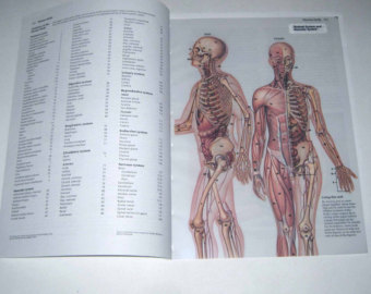
Layers in Photoshop are just like that. Any interface will be made up of different elements like buttons, headers, and labels. But to make sure each one is easy to edit later (this is very important!) each element is on its own layer.
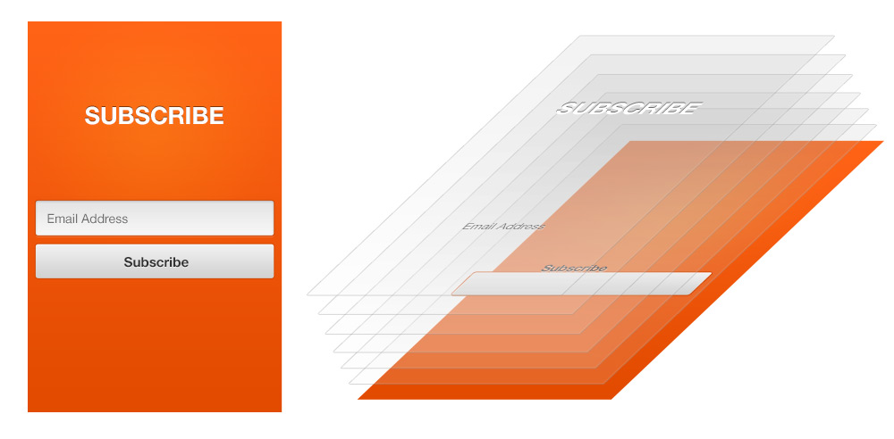
In the layers palette (on the right side of your Photoshop interface by default) that document looks like this:
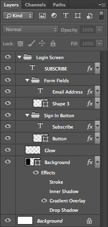
Just like with the transparencies in an anatomy textbook, the stack order of your layers is very important. Anything on the topmost layer will cover up content on the layers beneath it. But see that white and grey checkerboard pattern? That implies transparency. Anywhere a layer is transparent the content below it will show through into the final image.
You can draw on any layer at anytime. Just select the layer you want to draw on in the layers palette and start creating. But if your new content isn’t appearing on your canvas, make sure the area you are drawing on isn’t being covered by another higher layer.
Groups
Layers in Photoshop can get insanely messy. It’s normal for a interface design to have a few hundred layers—if not a few thousand! To tame this potential disaster you need to do two things:
- Name your layers. Seriously. If you plan to ever use this PSD again, name each layer as you create it (I actually failed to do that in the above screenshot. Oops!). Your life will be easier.
- Organize your layers with groups. Using groups (and naming them) is even more important than naming individual layers.
As you finish a part of your design you want to put those elements in a group. So if I have a button, two labels, and a text field I could place them all in a group called “Form.” I can then collapse this group by clicking the triangle so it stops cluttering up my layers palette and I can move on to the next part of the design.
Creating groups
You can create groups two ways:
- Click the “Create a new group” icon at the bottom of the layers palette (shown below).
- Or press Cmd + G.
If you opt for the second method you can select as many layers as you want, press Cmd + G, then they will all be instantly added to your new group.
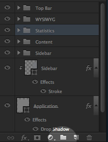
Groups can also be reordered just like layers and even nested inside other groups. All rules about the stacking order and visibility still apply.
Filtering
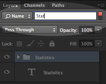
Even with named layers and nicely organized groups you can still get lost in a complicated document. Another solution just added in Photoshop CC, is filtering your layers. You can filter based on kind, mode, effect, etc. But most commonly, I filter by name and just enter part of the layer name I want.
Type
All interfaces include text. In fact, you can have almost exclusively text and still have a good design. So as a new interface designer it is worth your time to master the type tool in Photoshop. To start, I want you to remember two letters: T and V.
Pressing T will switch to the type tool—officially it’s the “Horizontal type tool” but you rarely use the vertical option. And pressing V will switch to the move tool. This is important because you will often press T, enter some text, then want to move it around by switching quickly between these two tools.
With the type tool selected (press T) click anywhere on your canvas. Here’s what I want you to notice.
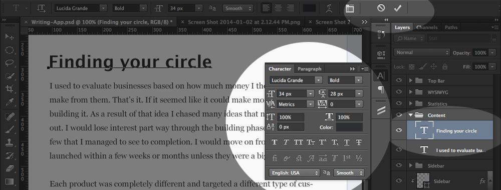
First at the top, notice the cancel circle and the confirm checkmark. Those are to confirm or cancel any current edits. While you are actively editing text you are stuck doing that until you deal with your edits. You can confirm by clicking the checkbox or pressing Cmd + Enter. If you just press Enter your text cursor will just move to the next line.
Next on the right side, I want you to notice that the type tool created a new type layer for you. It’s easy to overdo this and accidentally leave a mess of untitled type layers behind. Keeping an eye on your layers palette will make your life much easier.
Finally, in the center, I want you to notice the Character palette. Here you can change the font family (I have Lucida Grande at the moment), font style, kerning, leading (line-height in CSS), and more. The other commonly used type features when designing interfaces is the All Caps button (they can look so good…) and the Underline text button (denoting links).
Paragraphs
Now I mentioned that pressing Enter will move to the next line—just as you’d expect in any text tool—but you don’t use that often. If you want multi-line text, it is best to create a paragraph instead. How? That’s easy. Just click and drag when you create your text layer.
You have a new layer, just like before, but this one has a predefined area for the text to go.
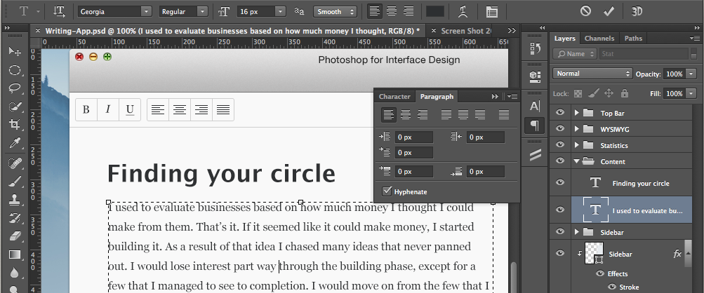
I also now have the paragraph tab open instead of the character tab. With it I can change alignment and indentations. If you are designing for the web you will also want to turn off the Hyphenate checkbox as you can’t hyphenate text (where part of a long word breaks to the next line with a hyphen) in a browser (at least not easily).
So whether you are creating a paragraph of text to represent a blog post, or a single word to be a button label, the type tool is critical to master.
Shapes and Paths
Next you want to draw a button. Why? Because all interfaces have buttons. So what tool do you use? The marqee tool?
Nope. That’s just used for quick and dirty work (or used by complete beginners).
Instead you want to draw your new shape with a vector drawing tool.
I guess we should first talk about what vector and raster. Vector objects can be scaled infinitely without losing their crispness. Raster objects on the other hand are pixel based, so if you scale them up they will quickly become pixelated and blurry. Photoshop is a raster drawing program (pixel based), but it does have some vector tools (if you want pure vector, use Adobe Illustrator). You should use those vector tools whenever possible.
So instead of drawing a button with the marquee tool you want to use the shape tool (press U). Now there are several different shape tools: rectangle, rounded rectangle, ellipse, polygon, line, and custom. You can press Shift + U to toggle through them. Select the rounded rectangle tool.
Note in the top bar that you can set the radius. That refers to the number of pixels of the curve on each corner—set it to 5px (our button is going to have rounded corners). Now when you click and drag you will be drawing a rectangle with 5px rounded corners. Make it long and wide and you will have made a button!
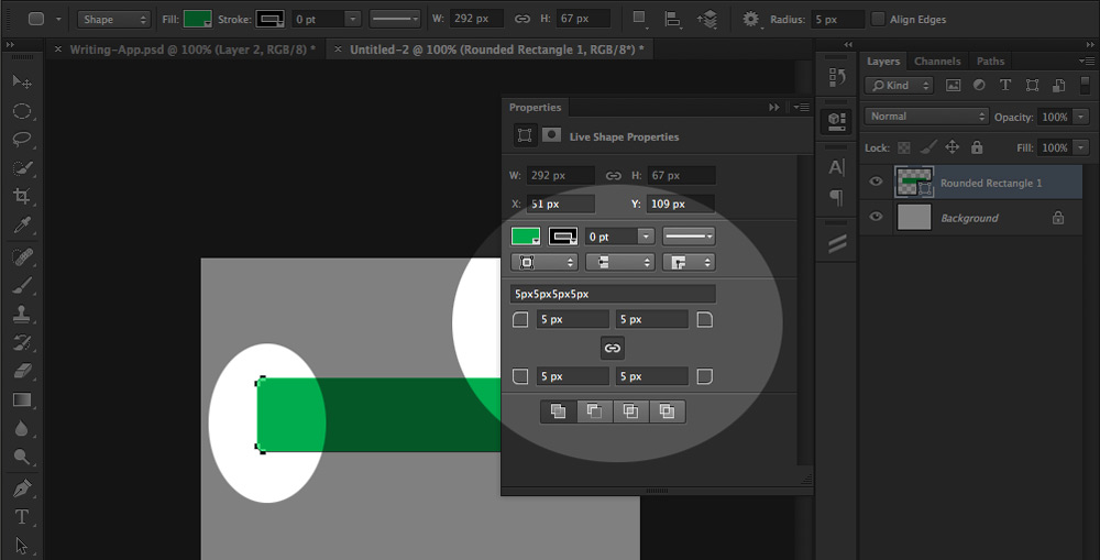
That created a shape layer for you automatically (always watch the layers palette). The shape in a shape layer is defined by a path. Paths are vector based (so our shape is also) and can be modified at anytime—which makes them awesome. Now look at the little squares surrounding the button—those are anchor points for the path. Paths are the most flexible method of creating objects or tracing photos—spend as much time learning to use them as possible!
Now take a look at the shape properties panel that is front and center. Here you can change the corner radius at anytime (new in Photoshop CC) as well as change the fill (I set it to green) or stroke colors.
Adding text
An unlabeled button isn’t very easy to use, so we need to add some text. Switch to your text tool, type out a label, and press Cmd + Enter. Next set the text alignment to center and use the move tool (V) to drag it into place. Once you set the text to all-caps and the color to white, you have a nice looking button!

Now, if you pressed V and it didn’t switch to the move tool, that’s probably because you are currently editing text (meaning you didn’t press Cmd + Enter). So instead of using a keyboard shortcut, you just typed the letter “v” on your canvas.
The pen tool
Since you will be using shapes so much, it is worth your time to learn the pen tool to edit those shapes. Many consider the pen tool to be an intermediate or advanced part of Photoshop, but I think anyone can learn it with a little practice. It really is critical to know it well in order to design software in Photoshop.
Layer styles
Last, but certainly not least, are layer styles. Layer styles can bring flat, boring designs to life. Let’s take that button, wouldn’t it be great to make it look three dimensional, but without having to add any more layers?
Starting with a gradient
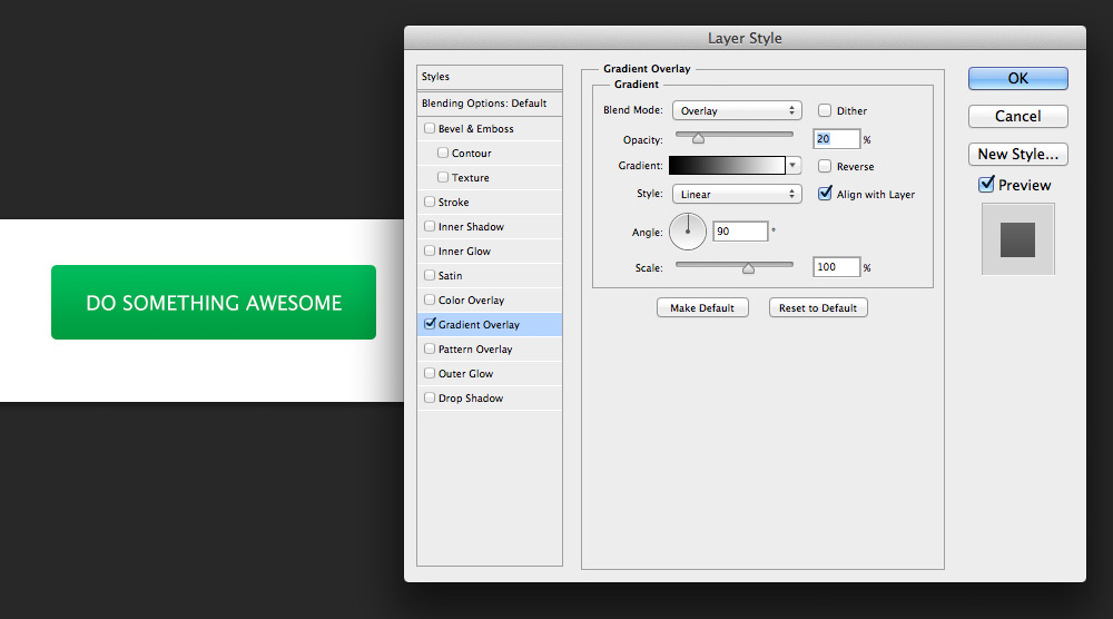
If you double-click on a layer in the layers palette you will open the layer style dialog. Then select the gradient overlay checkbox (and tab). Set the blend mode to “Overlay”, opacity to 20% and leave the rest set to the defaults.
Adding a stroke
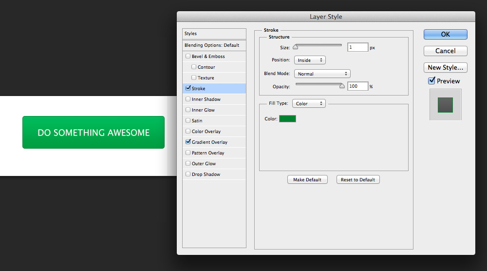
Now that the button has a slight gradient (which is starting to give it a 3D look) we can add more details. Next add a stroke. Set the position to “Inside”, size to 1px, and choose a color a little darker than the darkest color in your gradient.
Finishing with an inner shadow
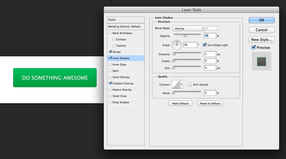
Finally we want a highlight along the top edge to make the button look more crisp. Oddly enough we do this with an inner shadow. Set the shadow color to pure white (#ffffff), opacity to about 40% (play with this), blend mode to “Overlay”, the distance to 2px (1px will be covered by the inside stroke), and the angle to 90 degrees.
That’s just getting started with what is possible when you use layer styles. Once you add drop shadows, pattern overlays, and glows the possibilities increase dramatically! Here’s an example of what can be created on a single layer with just layer styles.
Pretty crazy!
Continue learning
To become an expert learn more about layers, type, shapes, paths, and layer styles. Those are the basic tools used by professional designers to design great looking websites and applications.
If you want all the training you need in one place, take a look at my new course, Photoshop for Interface Design. I teach exactly what you need to know to design interfaces and skip over the parts that only photographers and graphic designers would use. In other words, you learn the skills you need so much faster.
The course will be out in beta on January 14th. Sign up for the email list to make sure you don’t miss it!



Awesome article! I was wondering if you could do an article about color scheme / brand identity. Everything I’ve seen from you shows amazing color and typography. As a developer, this is probably my weakest point and I’d love to learn.
This is really very helpful. Photoshop course for Interface Designers is something which has been missing for a long time now. I remember searching through Webdesign Tuts+ for something like this and never found anything worthwhile. So great to see you taking the time to create this.
One suggestion though. Maybe you can also list the PC alternatives for the Mac commands. I think there are some differences in the keyboard combinations.
I think I will do a mention in the course about translating between the two. It makes the videos longer to keep mentioning both when 80%+ are basically the same.
Yes that’s true.
I think that adding PC keyboard combinations would be very usefull.
Maybe just write them on the screen without any voice repetition.
Thanks
Great overview! There aren’t very many clear and concise “here’s what you need to know” PS introductions, and this is a good one.
It sucks that Fireworks didn’t get adopted as widely as it could have. IMHO it is miles above PS in terms of designing for web (since that is what it was built for). The interface is far more intuitive and makes all of the features you list above so much easier to use. Often FW uses the same tool as PS, so this tutorial is easily ported.
Having said that, PS is still the standard so learning it is necessary. However, I’d encourage any web designer to give Fireworks a shot – especially if you’ve got a CC license. You will love the “Export Area” tool!
Great tutorial Nathan! Thanks so much for sharing!
I would also love an article about color scheme and brand identity.
Great lesson on using photoshop for interface design. Thanks a lot!
A very important point for me concerning texts and paragraphs is, that texts that belong together should use the same text frame. Spacing between different paragraphs are being made using paragraph margins. This and the usage of paragraph styles makes it easier to use repeating styles in your design and on the developer’s side it gets easier to identify margins and repeating styles.
I’ve never understood (and wonder if there is any right answer deciding between Illustrator vs Photoshop. I found illustrator much more intuitive for web design than Photoshop. I;m curious for your opinion.
Great tutorial! I’m using Mac OS X Mavericks with Photoshop CC, had a hard time following the Layer Styles part.
Double clicking on the button layer would either pop up “Color Picker” or edit the name of the layer. I right clicked the button layer and picked “Blending Options”. That took me to Layer Style dialog where I could apply the things you mentioned.
Keep up the good work!
Came back today, hoping to sign up for your class!
Also, when working with strict pixel-based interfaces like web and mobile UI, I find enabling the “Snap Vector Tools and Transforms to Pixel Grid” option in Preferences is invaluable in retaining precise and sharp UI elements for export to the web.
You can enable that like so:
http://i.imgur.com/OajwniO.png