A core feature of nearly every email provider is the ability to design great email templates. Companies like Campaign Monitor even make this a core part of their messaging with their tagline “Send beautiful email newsletters.”
I believe that these email templates are not only a waste of time, but also harmful to your business. That’s why ConvertKit, my email marketing startup, purposefully does not include fancy email templates.
You should be surprised to hear this from me, since I am a designer by trade. I spend my time crafting elegant designs that I hope viewers will love. These designs can help build trust, show credibility, and create a better experience. I think they are incredibly valuable, but they shouldn’t be used in email.
Why?
Let’s take a step back and look at marketing in general. The best way to market online is to teach, to regularly deliver valuable content to your audience so that they will trust you and eventually want to purchase from you. So when you send an email, what part of the communication delivers the most value?
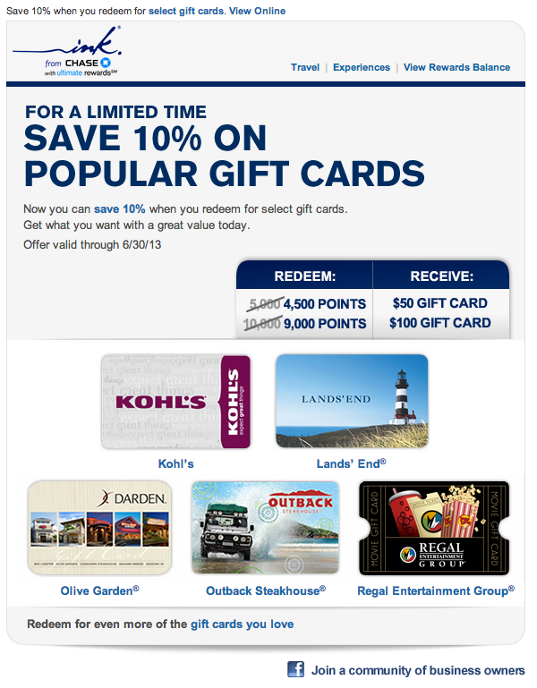
That’s right, the content. So we should be stripping away everything else that isn’t necessary in order to focus on the content. Multi-column layouts, background images, logos, and all the other nonsense that typically fills marketing emails doesn’t deliver value to the recipient. Instead it is all about you, the sender. Flip that around and start delivering value.
Emails that get read
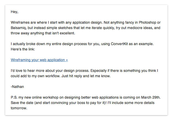
Go look through the emails you’ve received recently that you actually wanted to read. They probably came from individuals. Not big brands or companies, but someone you have a connection with. Those emails certainly didn’t have a fancy template or design. They were just plain text, that got straight to the point.
Emulate those emails. Stop emulating the emails that never get opened or get sent straight to the trash.

The wrong focus
So maybe I’ve convinced you that email templates don’t add any value, but how are they harmful?
It comes down to focus.
Everyone who is handed a what-you-see-is-what-you-get editor and told to design or customize an email template jumps right in and starts customizing everything. Let’s ignore that usually, since most of these people aren’t designers, the results end up pretty bad. The true problem is that when crafting an email 95% of the time is spent getting the design just right and only 5% is spent on the subject and content.
Where does the value come from?
Yep, from the content. So amateur marketers everywhere are using customizable email templates as an excuse to ignore writing the actual email (which is arguably the hard part). By taking away the distractions you are forced to focus on delivering real value to your customers. If your email sucks it is because you wrote it poorly or had nothing to say.

Not plain text
Note that I am not advocating plain text emails. Clickable links, basic formatting (bold, italics, etc), open tracking, and click tracking are all really important. Take your existing email templates and strip out all the other design elements.
If your email looks like it could have been sent to a friend using Gmail, you are doing something right.
If you are interested in trying an email marketing application that has these best practices built in by default, sign up for a free trial of ConvertKit.
–


Nathan, I’ve noticed that all the emails I actually read are sent in mostly plain text format. That’s why I decided to use that format for sending out updates from my design blog.
I really appreciate your focus on the important stuff – content. This approach has worked wonders for my business. Rather than starting with a fancy design and then plugging in the content, we start with as much content as possible and then design the layout, grid, colors and everything else around it.
I’ve been thinking about “Flat Design” lately and I believe some of the best designers who advocate this minimalistic style are trying to draw the attention to the content. What are your thoughts on the whole Flat Design style with regards to content importance?
Keep publishing and building!
Hello Nathan,
I have to say that I disagree with your suggestion of striping down all design elements down to a Gmail looking message. I believe that design can make a message stand out and even make it more readable than, for example, a simple block of text.
I’m on the same side, of course, regarding overdesigned elements that work against the content.
At the beginning I started writing my comment here, but as I saw that it started to grow bigger, I decided to write an actual blog post instead.
Forgive me for posting the link here, feel free to follow it or we can carry on the conversation, if any, here.
http://www.martzoukos.com/profession/overdesigning-email-templates
Thank you :).
Nathan, I must say that while I was reading this article, I had a little voice in my head saying, “Of course, it’s just easier not to provide rich media editing functionality in a saas product and thus preach that simple text emails are better.” However, during those few days that have passed since reading an article, I kept noticing that I have not read a single fancy newsletter in a while. I just ignore them. The best ones that I always read are nicely formatted (in terms of whitespace) plain text personable messages. Thanks for getting that point across to me :)
I’ve just recently stumbled across your blog (and have read all the posts already :)), so I am a bit confused – are you currently in Dan Maxwell’s program? Are you documenting your progress as you go through the program in real time?
Cheers!
It is definitely easier, so even if I didn’t believe simple was better, I would start there. But I really do think everything I wrote in the post.
No, I’m not going through Dane’s program. I just liked his style for idea extraction.
Thank you for clarifying, Nathan!
Hey Nathan,
I completely agree with you. I don’t think I ever do anything more than glance at an e-mail unless it looks like a regular old g-mail message.
But!
What if you are just starting out, trying to build up your brand? Do you have any advice on how to sneak a brand logo into an e-mail? Or is that totally out of the question?
It’s difficult to practice restraint with design, when you need to make an impression with your brand!
Thanks,
Cassie
I’ve always felt this way, and it’s nice to hear someone else echo my opinion. I’ve gone back and forth doubting my gut because a brand as cool as mailchimp really encourages you to design the “newsletter” look. But I always get more value when I treat my email like a conversational with my recipient.
But I have a concern, when you make it look/feel personal, how do you address the whole “unsubscribe” or “merge tags”? You know, all the little things that say “hey, this is not actually a personal email, it’s still a mass mailing after all!”
What do you think?
I like what you are saying about email messages teaching something – but you are forgetting that people learn in different ways. Taking out visual graphics eliminates all of those consumers that learn better through visual aid. I am one of those people and I am a graphic designer. I feel you need to find balance in the message between content message and design. Also, the design is like a ‘hand shake’ to the company. It tells the consumer what kind of company you are: classy, fun, young, traditional; etc. etc.
I’m not saying remove all images—just remove the sidebars and design elements in emails. Make it feel personal and not like a canned mass email from a huge, impersonal corporation.
Nathan,
Love your candor here. I’ve been preaching this idea to my clients for quite some time. Send an email that behaves like EMAIL, not like a direct mail postcard. I help users focus on a few key elements to get their email read as well
1. Using your name for sender, instead of your company name. Think about that. Email is a personal medium, and we like to hear from people, not from faceless companies.
2. Put thought into making your subject line interesting, fun, and curiousity-inducing. For inspiration look through your inbox or archived email and look at the titles of the emails you’ve opened.
3. Ditch the “View in browser” message that all of the email marketing companies put in by default. If your users follow your suggestion about stripping out all of the distractions, they will be able to see everything just fine anyway.
4. Keep your email to one topic with one link. If you desperately need to say more than one thing, send more than one email.
5. Write your email as a personal message. You know, like email. :)
Alright, I guess I get a little excited about this topic.
Keep up the great work, Nathan! BTW, I absolutely LOVE your site design here. Great stuff.
Nathan –
Great post. I Googled this topic hoping I would find people thinking the same as me!
This brought me to wonder: what if it was dumbed down even more? What if the e-mail was in Comic Sans. Would it be considered so casual that people would think it’s from a friend and, therefor… read it?
Hi Nathan:
Thanks for a brilliant post!!! I have been preaching this to my clients for years. Those that follow my advice make more sales and receive more responses. Those who insist on using the fancy newsletter type emails don’t track responses or sales – and talk all about the “corporate image of The Brand.” It makes sense that when we all receive so many emails in a day – that we look at those we think have been sent “just to me”. Those which are fancy and filled with graphics, I KNOW have been generated by software. Keep up the good work
I know this is ages old, but wanted to play devil’s advocate for a moment. First of all, I must be an unusual user, because I quite enjoy nicely designed emails, and sometimes open certain messages simply because I know it will be beautiful. As a designer, perhaps this motivation is atypical.
But quite a few major players use nicely designed emails to great success, in my opinion. Pinterest, Twitter, Google, and a number of sites and services to which I subscribe use html emails, and I love it.
Now, let me caveat by saying this: I agree that “beautiful e-mail templates” are mostly a horrible mess and should be avoided. Why? They look the same. They look corporate. They are generally stuffy grid layouts underlying a paint-by-numbers yawnfest.
Great, we all agree. So why am I writing? Because I don’t think templates equate to beautiful emails, and I don’t think that plain text is the only good option. Sure, for a straightforward approach, plain text can be great. But I believe in “enchantment”, to borrow a word from Guy Kawasaki. Mesmerizing, wonderful, unexpectedly charming email. Carefully crafted by hand, and sent with personality and care. No template can properly achieve this, naturally, so it has to be built from scratch. But after the hard work is done, or the designer is hired, the difference is like night and day.
We recently tested some newly designed material on our audience, and the response was incredible. It has been my experince that people love something beautiful if it is not thoughtless and stodgy.
IT SHOULD BE FUN. And that has been our belief from day one. We will see how it goes from here out. Just my $.02. Thanks for the post!
The question I have is what about if you are an artist? I am and I know that including images of my work is part of what I am sharing with my group. Also, the designed emails that I do read are from artists or other creatives. I enjoy the visual. What do you recommend for visual artists?
There is one person, whose list I am on, sends plain text emails and while I am sure they have good content, it is so visually dense and not easily skimmable that I don’t read them. She is well respected but I don’t read her emails because they aren’t easy to read (and I am a voracious reader).
Emails that I read are from larger brands like Grant Cardone and some smaller as well. Most have pictures, and graphics. I am less likely to read a text only email and the emails I enjoyed the most were feminine and had pretty buttons.
I agree with Angel. I have received many emails from businesses that use Convertkit and they were too boring and did not capture my interest. That being said I have also received emails that had way to much graphics and felt it was overwhelming. As a women that likes a feminine beautiful clean minimalistic design I have never liked the text only emails from companies. I get so many emails that I need something that grabs by attention without being overwhelming