In the two years I’ve been designing and developing ConvertKit I’ve always focused on simple usability. With limited time and money I couldn’t make everything perfect, so I wanted to make sure the usability was excellent before adding that last level of polish.
Basically I focused on user experience before user interface.
I think that was the right move initially, but the result was a powerful application that worked well and was easy to use, but wasn’t going to win any design awards.
Now that the product is more rounded out and full-featured, it’s time to go back and add that level of polish that takes it from good to great.
The original design
When we built the first version of the registration page the process was simple: list out information we wanted to know and create form fields for each one. Here’s what we ended up with:
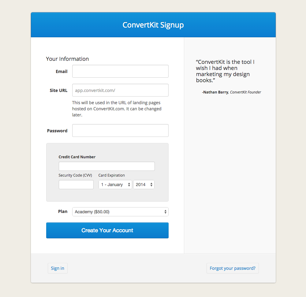
There’s a lot wrong with this. Why are we asking for name and a URL right on sign up? We don’t actually need a name and the URL is something we can generate automatically and let the user customize later.
Looking back at how complicated the form was is actually rather entertaining.
The credit card problem
Because we have such an emphasis on customer support at ConvertKit I wanted to make sure each new customer we got in the door was serious. That’s why we require take the full payment up front (instead of offering a trial), and just provide a money-back guarantee for those it doesn’t work out for.
That’s good, except there are a lot of people who who are considering signing up, but leave the page after seeing the credit card requirement.
Some may not be serious customers, but there are probably others that wanted to try out ConvertKit, but didn’t have a credit card handy.
With our current form design we don’t have any way of finding out who was interested and then bailed at the credit card requirement.
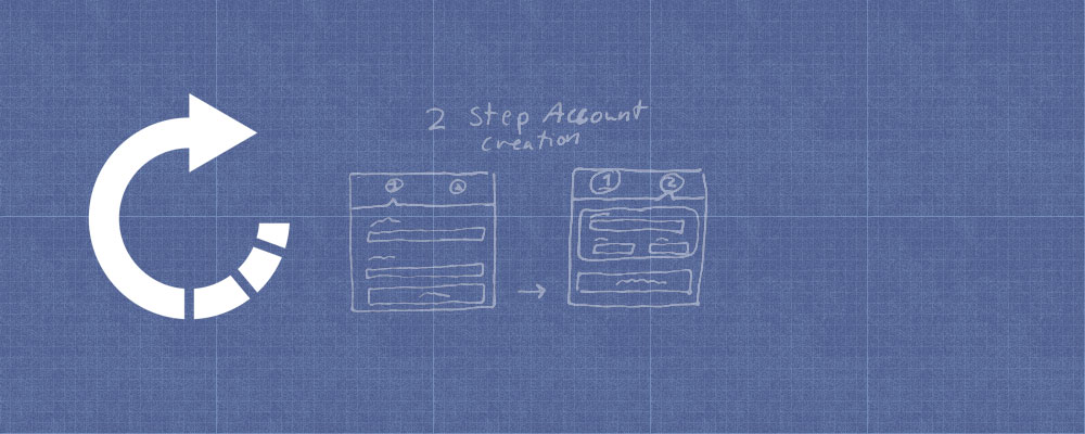
A two-step process
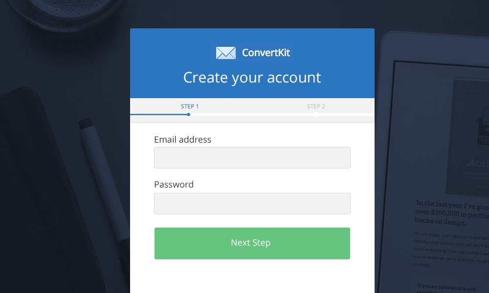
The simple solution is to move to a two-step account creation process. Step 1 is your basic information, step 2 is the credit card details.
After step 1 is complete we can create a basic account (just without billing) or at least save their information as a lead to follow-up with later. If they complete step 2 they become a full customer, but if not, at least we know who they are and can get in touch with them.
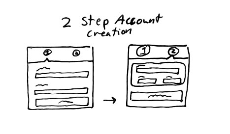
After sketching out a very simple wireframe I took a first pass at the design:
And then for the second screen I designed a more elaborate credit card form.
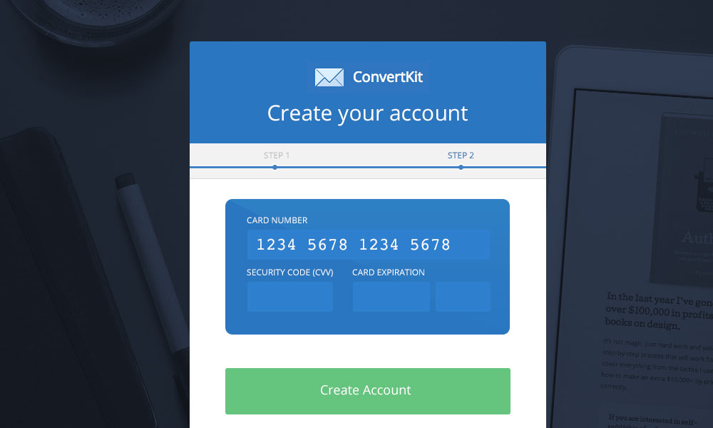
A new direction
I really liked the idea of laying out the credit card fields like an actual credit card. By changing fonts and adding a few design details I knew I could create something more visually interesting than typical form fields.
But I really didn’t like the card-inside-a-card approach. A credit card inside the larger container just didn’t feel right. So that would mean changing the account credentials step to look more like a card.
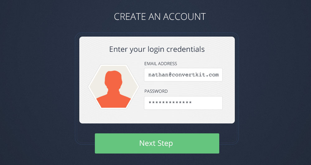
An ID badge
It didn’t take long before I came up with the idea for the first set of fields to be designed like an ID badge with the a photo on the left and fields on the right. Once I ditched the main container the ID badge idea came together pretty quickly. These are my final Photoshop mockups:
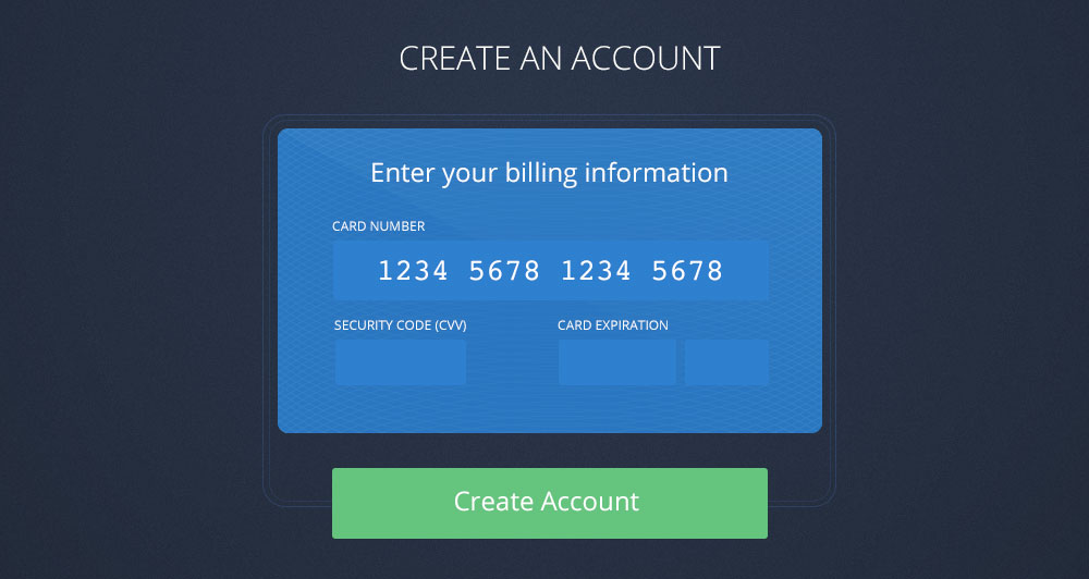
Final details
When designing the card I remembered a design from BankSimple (before it became just Simple) that was a sort of geometric pattern. It looked cool and bankish (that’s a word, right?). Unfortunately I couldn’t find a screenshot from their old site, so I created my own pattern by duplicating and overlaying a bunch of circles.

That pattern, inverted and placed in the background, adds a nice final detail to the card design.
Adding Gravatar
I used an icon for the default avatar, but then realized that we have an email address, which means we can go fetch a Gravatar for that account—even before they sign in or create an account.
So once you move to the password field we use JavaScript to go grab a Gravatar if it exists.
Also on the final version I moved from a hexagon image to just a basic circle. I can make the circle with CSS and the hexagon would have required another image.
Animation
With two cards I just had to use a flip animation to move between them. You fill out the ID badge part first, then flip the card over and fill out your credit card information.
It’s not accurate to the real world, but it’s fun. You can see this animation, as well as the final coded version in this video (click it to stop the autoplay):
I wanted to add more animations for when the page loads and if you enter the wrong password (on the sign in screen), but my allotted time for this project was up and it was time to release it. Maybe later I’ll circle back and add more details.
Any questions or thoughts? Share them in the comments.


Thanks for sharing your thought process, Nathan. When we added billing address to the registration process the number of failed charges dropped significantly. I’m curious … Have you ever experimented with adding billing address?
I’d also love to read more about your process for converting the users who don’t complete the credit card.
That’s awesome! I love hearing about the process behind designs like this. Thanks for sharing.
I really like the card idea. To me that’s one of those ideas that seems so obvious in retrospect, it’s a wonder why I haven’t seen it anywhere else. Those “so obvious” ideas usually turn out to be some of the best designs :)
REALLY NICE IDEA. Simple And Quick Process. :)
Excellent post. The card idea was awesome and as Dave wrote above, I wonder why we have not been seeing it everywhere! :)
It looks cool and freshly! Have you already tested how it perform against the old one?
Loved the article. The card’s background, the round gravatar, and the animation is where it all comes together beautifully in the end.
Great article. I would swap the cvv snd the expiration date. The card number and expiry are on the same side of the card, cvv is on the other side. So you only have to flip your card once.
Great post. I love these kinds of step by step design/UX insights.
I can’t help but think there’s one major problem with the “final” design. I (the user) don’t know what to expect after the first step. What does “next step” mean? How many steps are there?
I feel that the simplicity of the first step calms me and set expectations that the next step shouldn’t be anything big but personally, I would add some indicator that there’s only two steps. The interaction probably feels great to you as a designer now, but most people will only do this once, and they don’t know.
Where did you get user photo on the first step in the video?
Second step is nice but I have a feeling of “design for design” not for best UX.
Nice redesign! Especially love grabbing the Gravatar before the user has even finished the form!
Nathan i think you’re so creative. For me a lot of times I wonder how possibile it is to be this good a great web app developer from being a great designer. I hear a lot from designers that you dont need to know JQUERY, PHP, MYSQL and all that to be a great designer – you’ve proven them wrong. You’ve proved that you can be a great designer and a great programmer which sets you on a very different pedestal from others who seem to just limit their capability to design alone. This is great and you know what? You’ve inspired me to learn programming (I’ve limited myself to design these past years) because I love your approach and how you teach, I think you’re awesome and I sincerely appreciate the VERY GREAT WORK YOU’RE DOING. Weldone. GOD BLESS YOU REAL GOOD!
That’s super pretty! … but the skeptic in me wonders about two things that might hurt conversions:
1. You’ve replaced your progress indicator showing 2 steps with a more opaque ‘next step’ with no sense of how far you need to go.
2. If a card flips to offer CC input, you may have people wondering how secure it is even though the card flip has nothing to do with security. Odd css things seem to impact conversions… I forget the source but just by adding a grey background with an image of a lock or something beside the CC fields improved conversions in at least 1 a/b test. You have gotten extra creative/pretty (seriously, it looks awesome) on something that may benefit from more of a conventional approach. Your target market may/may not be more educated than avg, but the sign up still needs to ‘feel’ secure on top of actually being secure I think.
Anyways, super interesting read as always and I’d be interested in any a/b test results if you end up testing it.
Cheers!
Gavin
Whenever the skuomorphic credit card entry comes up on Hacker News, someone will point out that it tests very poorly in “Real World” UX tests.
I’m sure it depends on your audience though; my Mum isn’t buying ConvertKit, for example.
Your sign up form warning messages (email & password) hide the field labels, which means users who didn’t see/don’t remember the field names wont know what to write in the fields.
I actually like the one with an image in the background
I really like your idea of the ID/Credit card look like UX!
But about the credit card : wouldn’t it be good to add a logo of the company that will process the payment? I had to make a similar UX myself, and decided to add a Stripe logo to show that my form is safe. This way, I want people to feel confortable about giving me their credit card number. Of course, the downside is that it makes the UX heavier. What do you think about that?
Second, when you started to speak about the “credit card problem”, I thought you would go further, and lets users start using ConvertKit before adding their credit card. It is what I did : I was asking people their credit card before they could start a ad campaign on my site. Now I changed that : they can create their campaign, but needs to add the credit card as a last step before the campaign is visible to everybody. So it let people engage with the website before they pay. Is this something you thought making in the future?