In a few weeks, on January 1, 2019, ConvertKit turns 6 years old. As a fun way to celebrate and look back here is a compilation of the design and feature changes through the years.
What started as a simple app has grown into a global business helping 20,000+ creators earn a living online. As you look to create your next venture I hope it inspires you to see how rough and basic ConvertKit was when it started!
Launch – March 2013
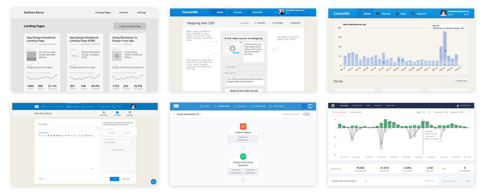
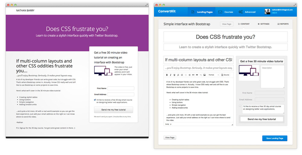
The very first version of ConvertKit was focused on making it easy to create a landing page and then send a series of emails to new subscribers. This was the first rough wireframe I made for how to view and edit a landing page in ConvertKit.
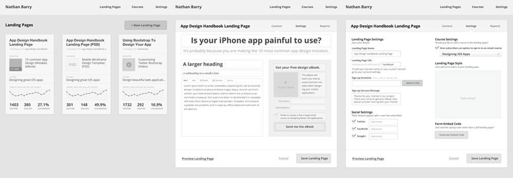
There wasn’t any kind of fancy landing page builder. Instead it was simply a series of text boxes to fill out content for that area. If you wanted to delete a header, you’d just leave it blank. While this worked, it was clunky and didn’t have any flexibility. The CSS course landing page was the very first landing page created in ConvertKit.
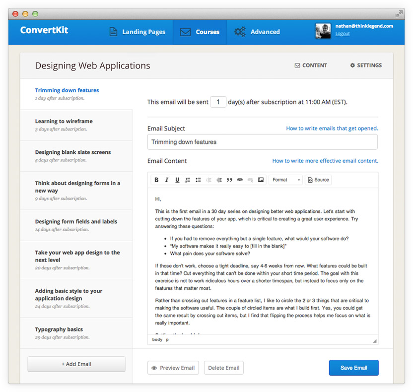
Initially the app just had three tabs: landing pages, courses, and advanced. I always hated the term autoresponder, which was common at the time, so I chose course instead. We later renamed course to sequence.
The best feature of ConvertKit was the ability to see your entire email series at a glance and move between it seamlessly. Now, even five years later, this interface is still remarkable when compared to competitors.
Look at those default bootstrap buttons!
At this time I was creating landing pages and email courses (sequences) inside ConvertKit, but then still managing my main email list through MailChimp to send broadcasts and organize subscribers.
In June 2013 we added basic list functionality (the subscribers in a group of forms) and the ability to send broadcasts to them. Around this time I was able to start to fully move from MailChimp to ConvertKit for everything.
2014
In 2014 I tried to augment ConvertKit through offering training and coaching through something I called “ConvertKit Academy.” It made ConvertKit more like an info product rather than SaaS, and was a hope to hold the hands of some new customers and make sure they were successful.
Ultimately the strategy didn’t work out, but I learned a lot and it helped generate some revenue to continue product development.
Around the same time we added forms in addition to landing pages. Forms became the main heading and landing pages became a subset of those. At some point lists became a main navigation item with broadcasts underneath it.
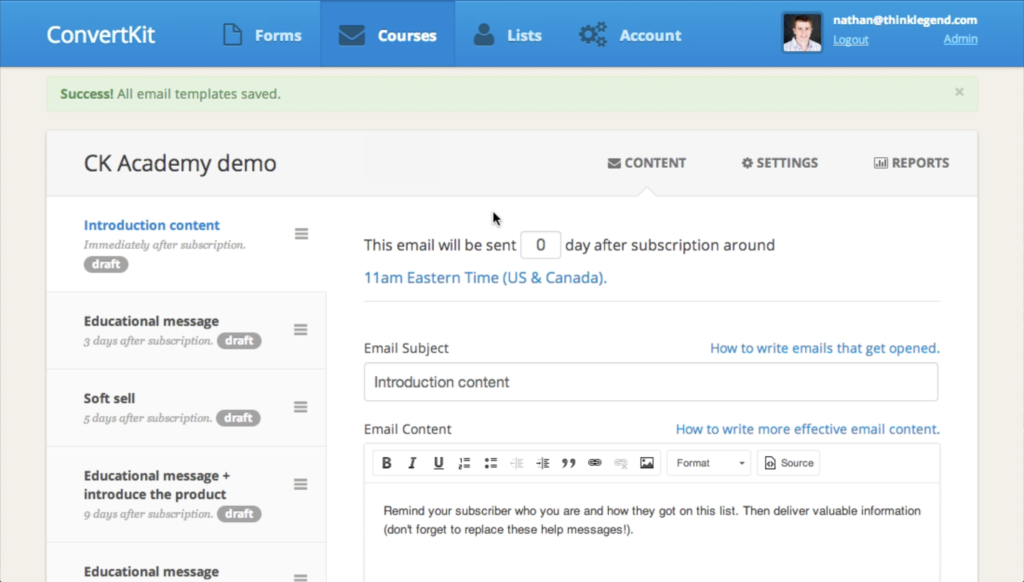
We also added a new subscribers graph to the forms page. This graph is still there today!
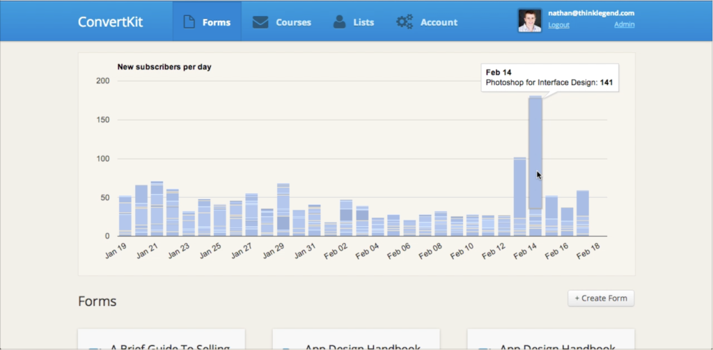
Everything was managed by forms. You would import into a form. Lists were a combination of multiple forms.
Notice anything crazy about those screenshots? It still just says ConvertKit in the top right corner. Well over a year in ConvertKit still didn’t have a logo. The logo went live in October 2014. Nearly two years after launch!
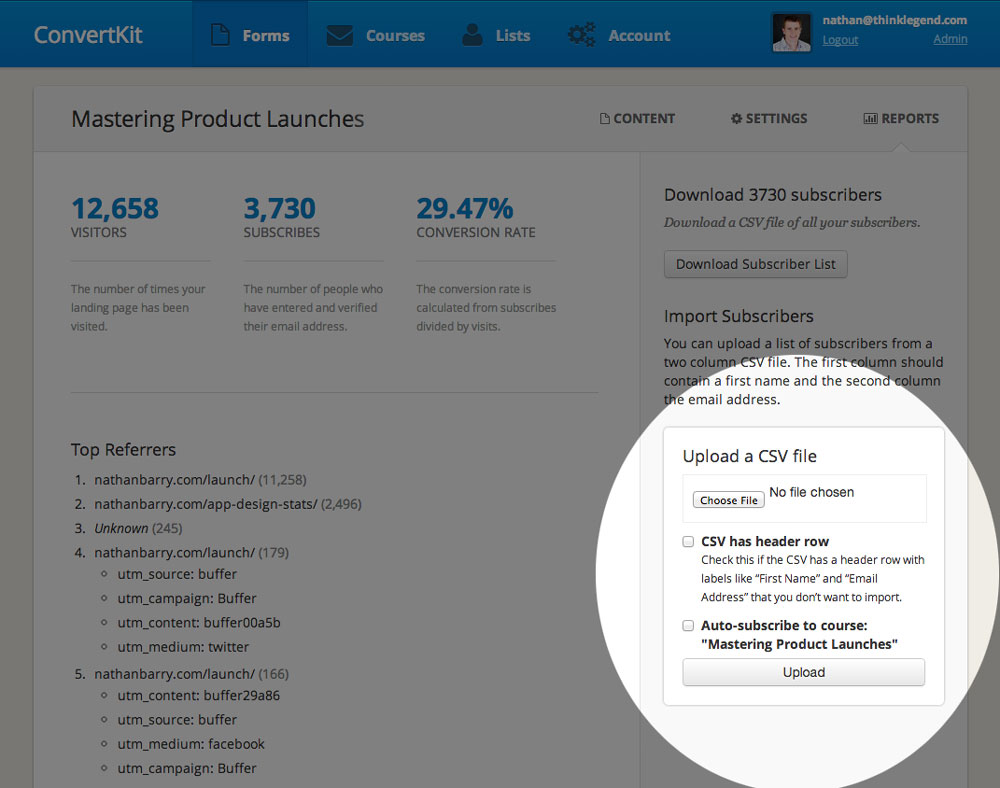
Around this time we also launched basic filtering and segmenting of subscribers.
2015
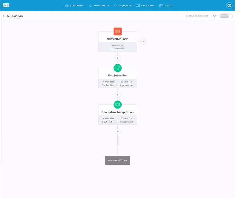
Automations!
In 2015 we started to make a lot more progress on development now that there was a team working on ConvertKit full-time. The first move we made was to build out a trigger/action based automation rules system. We launched it with a direct integration with Gumroad where you could add a customer to a form after they bought a product.
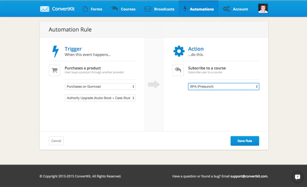
At some point broadcasts replaced “lists” as the top level element.
Wait, why a form and not a tag? While, that’s because in 2015 we didn’t have tags. All the segmenting happened through forms and courses. It worked, but was unwieldy when you started adding forms for things like “Purchased: Authority” that no subscriber would ever opt into.
In July 2015 we announced tags so customers could better organize their subscribers. It was a big change and we should have done it months earlier!
2016
By January 2016 we were doing over $100,000 per month in revenue, which meant growing the team. That summer Dylan joined the team as our first product designer. The first thing he did was to clean up the interface a bit and make it more flat. So the rounded header was gone and we added a new set of icons.
2017
In January 2017 Dylan flew out to Boise in the middle of winter (he came from Florida). During that winter wonderland we designed visual automations along with a full refresh of the website.
Along with all the new features the colors and icons became a lot more refined. We also changed the tan background to a very light grey. Many people loved the clean look, but with all changes there were people who complained. My favorites were the ones who said, “it was like staring at a light bulb” and “even my mom thinks the tan background was better.”
This change also brought brighter accent colors throughout the entire app. It became a lot more lively and fun with the colors and icons.
July 2018
This summer we announced a new logo along with our rebrand to Seva. The new name ultimately was rolled back, but the logo stayed. The logo was inspired by the golden ratio to give it a level of precision that represents many of our creators who code and design, but it also ends in a brush stroke include the more organic, natural creators.
![]()
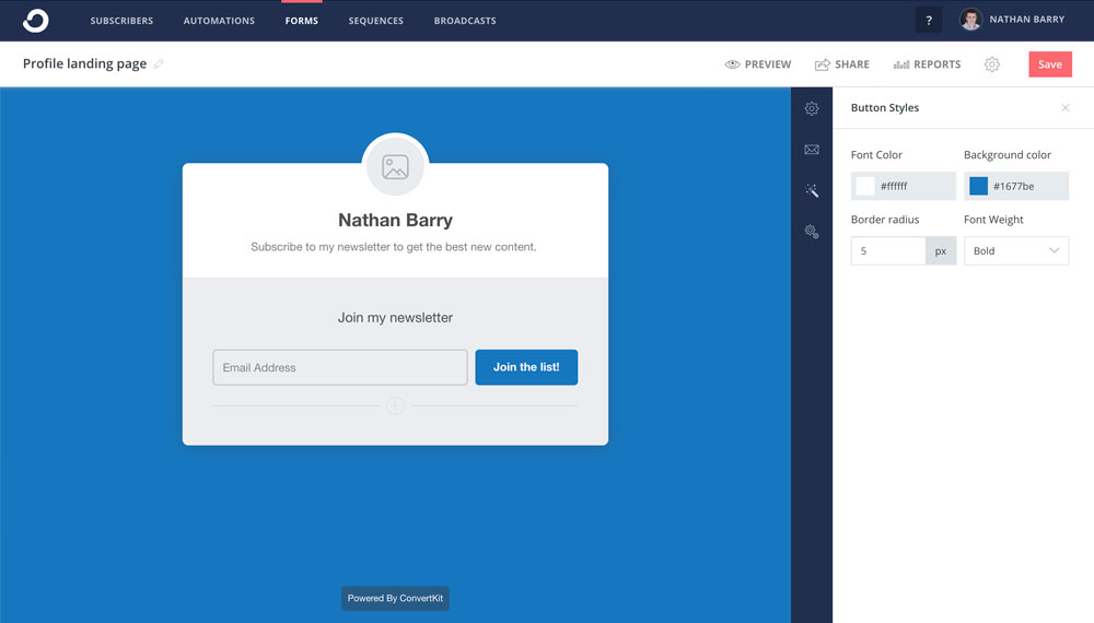
At the same time we focused on the oldest part of the app: forms and landing pages. We’d made improvements over the years, but some of the original code was still there in that part of the app. So it felt really good to rewrite it from scratch.
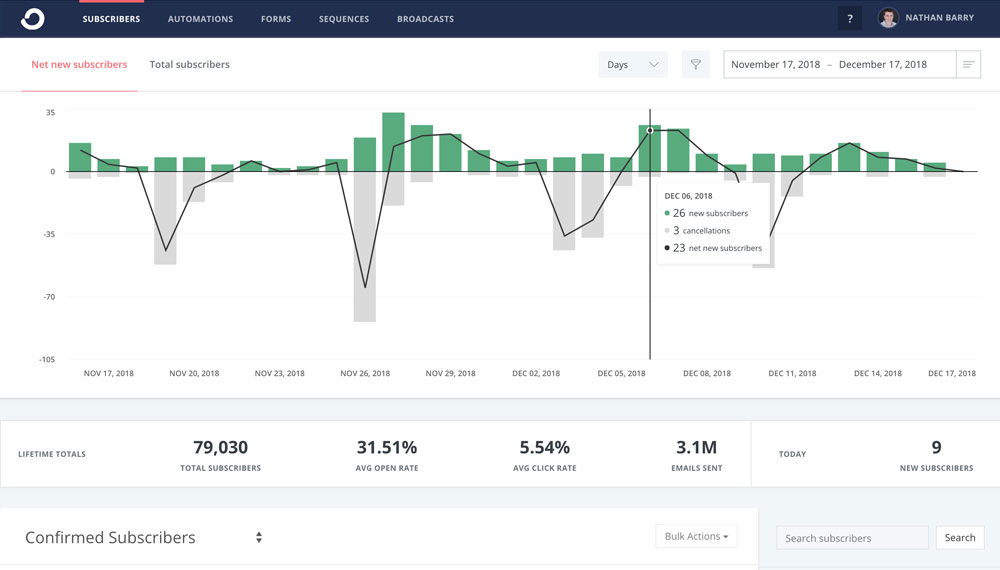
We also reworked the subscribers page to add a new graph to the top along with other powerful reporting. That meant we could show the total subscriber growth over time for the first time!
The subscribers tab replaced forms as the default tab when you sign in.
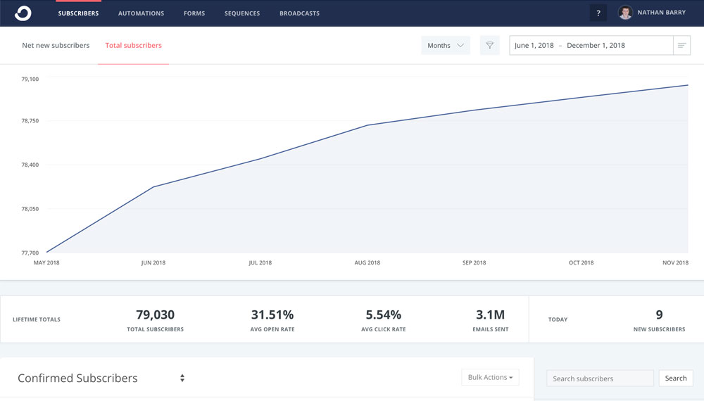
The most recent interface change we made was to change the default graph when you sign in. Before it showed your total subscriber growth over time, but now it shows the subscribers you’ve gained and lost each day. It’s more actionable in the short-term, whereas the other graph (which is just one click away) is better for stats over time.
That takes us to the present design! I hope you’ve enjoyed this walk through the last six years of ConvertKit. Whatever product idea you have, just start. It may be ugly and lack features at first, but if you stick with it for years then it can become something quite remarkable!
***
Do you have an early screenshot of your app? If so, link to it in the comments.


So cool to see the evolution over time! I’m a fairly new ConvertKit user but have been following your work for many years. Authority was a big help for upping my self-publishing game and I plan to re-read it again shortly before launching my next book. Keep up the good work!
P.S. Any plans to do an updated version of your iOS app design book? And any chance of a ConvertKit mobile app coming some time down the road?
I remember many of these designs! Cool to see how it’s evolved over time, and that it’s still going :)
Keep up the good work, ConvertKit!
Great to see how you started with the MVP and then organically kept adding features and design while focusing on UX rather than UI first. Would also love to see an iOS app, anything planned for mobile apps?
Keep up the good work, my email headaches disappeared after switching to CK :)
This was a good read
Love these!