I’m working on the second edition of my book Designing Web Applications. Back in 2012 when I released the book it was incredibly well-received. But after a couple years it’s time for an update.
The second edition will launch on Wednesday, February 11th. That’s a week from today.
So if you’re ready to start designing better web applications, mark your calendar.
Between now and Wednesday I’ll be sending a few articles on designing better web applications along with previews of the book.
Let’s jump into 3 Critical Web App Design Mistakes:
1. Ignoring the first run experience
When designing, should you focus on 99% of the experience or 1%? The obvious choice is you should focus on the 99%. In software, the 99% is how someone will use the tool day in and day out every day. Whereas the 1% is how they will use it the very first time.
But when we put the question in context, the answer starts to shift. It’s no longer the obvious choice to put all your effort into the everyday actions if it means neglecting that 1%.
A good user experience designer knows that even though the first-run experience may only be 1% of the total interaction a long-term customer has with your tool, it’s the most impressionable.
Usually the customer has no clue what they are doing in the moment just after signing up. Also, in the moments after signing up, they aren’t sure whether or not to trust your software, or if they’ll stick with your tool long-term. Therefore, even though it is only 1% of the total experience, the first-run is by far the most critical.
Besides, if you don’t wow them with the first run experience, they won’t continue as a customer. So instead of it being 1% of their total experience (as it would be with a long-term customer) it may turn out to be 100% because they never get set up, and cancel their account after a day.
3 tips for a better first-run experience
- Pay attention to the blank slate.
The ‘blank slate’ is what we call a page without content. Imagine your todo list when it doesn’t have any items written in yet, or the invoices page before you’re ready to bill a client – that’s the blank slate. Usually, a blank slate is just a simple message about what the page does with an arrow pointing to what the user should do next (usually the “new _____” button). - Teach your customers.
We want to teach customers how to use our software, but what if they aren’t particularly good at the overall task? What good is an email marketing tool if you don’t know what to send? In the case of ConvertKit, we teach our customers how to use it to send emails and grow their lists, but we also teach industry best practices, as well as strategies for how to build a relationship with your readers. - Send welcome and usage emails.
In-app messages are great for directing users, but they will be more effective when combined with emails to customers explaining what to do next, as well as highly relevant, actionable educational emails throughout the customer lifecycle. The project management software Planscope sends out weekly emails with account stats and other useful information. Each email also includes a link to training on how to run projects more effectively.
Inside Designing Web Applications we cover the first run experience extensively. Including an interview with Samuel Hulick from UserOnboard.com.
2. Inconsistent navigation
Clear navigation is critical for a user’s mental map in navigating an application. This may seem basic, but I find that developers who think design is not part of their job description will add random links to one page, which then becomes very difficult to find later.
Painful school software
The college I attended (Boise State) has a student management application called BroncoWeb (our sports team mascot is a bronco), which is definitely the single worst piece of web software I’ve ever encountered.
We had to use it to register for classes, pay tuition, and check grades. Luckily it didn’t need to be used every day, but I always dreaded class registration days where I would be forced to spend time with this usability nightmare.
Caused by bad navigation
The biggest problem with BroncoWeb was inconsistent navigation. Commonly used pages could only be accessed from pages three layers deep. Then, when you wanted to move to a different section, you had to return to the home page before venturing down a new rabbit hole of links.
It is very important to have your main navigation be consistent across all your pages. Not only should it contain the same links on each page, but the links should be in the same place.
A broken back button
You’d often try to get back to a previous page through a tried and true method: the back button. Unfortunately BroncoWeb’s back button didn’t work.
Because of the way this ancient software had been written, clicking the back button actually submitted a form. As a result, to move back a single page you’d often have to start the navigation process from scratch.
This shouldn’t be a problem today, but unfortunately, as more applications try to do everything without page refreshes (mostly a good thing) the developers forget to build in support for the back button (a very, very bad thing).
Don’t let fancy functionality break core browser features.
3 tips for better navigation:
- Limit your top level navigation to 3-5 items.
Too many top-level sections will overwhelm your users and confuse them on where to start. Keeping it to just 3-5 will keep your header from looking cluttered, and will force you to think more carefully about your navigation structure and page formatting. - Place sub-navigation in the same place on every page
You will inevitably need more than just 3-5 pages total, so that’s where you should use sub-navigation. Those sub-navigation menus need to be placed in exactly the same place on every page. Then, users will know exactly where to find more detailed pages. That means you can’t have one section with sidebar sub-navigation and another with header sub-navigation. - Avoid obscure links to particular settings
You’ve got a little extra functionality that isn’t commonly used, so you just add a link from a settings page, right? Uh oh. Now we have a problem. This obscure page now exists outside the normal navigation structure. If we were to make a little chart showing the hierarchy of all the pages, it’d be way off to the side. This means users will find it once, but then the next time they need to tweak those settings they’ll have trouble finding their way back because it doesn’t fit their mental map of the application. You’re allowed to have additional links to other pages outside of the navigation, as long as those pages clearly fit within the application page structure.
3. Complete Redesigns
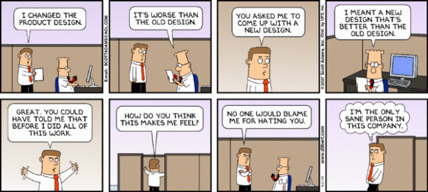
A few people may disagree with me on this, but I think you should never launch a complete redesign of existing software. I thought this Dilbert cartoon summed it up pretty well:
Let’s picture a little scenario: Jenny is a designer at a well-known marketing agency. She uses your tool every day to ship projects to her clients. On Friday she is really damn good at her job (partially thanks to what your tool enables her to do).
Over the weekend you ship a complete redesign of the software. On Monday morning Jenny gets an early start in order to meet her looming deadlines.
But wait…everything’s different. She’s no longer a pro with your tool and her ability to do her job is greatly decreased.
Sure, you have new videos explaining the clever new things the redesigned tool can do, but Jenny doesn’t have time for that. She has designs that are due by the end of the day.
She used to be really good at her job, but you screwed that up. It doesn’t matter if you had the best of intentions.
Full redesigns introduce new bugs
Remember all those bugs you fixed for the first couple months after launching? Obscure browser issues, annoying quirks on mobile, and let’s not forget the obvious stuff you should have caught in testing – but didn’t – because your fake data didn’t represent actually use.
This new redesign will introduce a ton of bugs. But what’s more frustrating is that you can re-introduce old bugs, which sucks.
Version flipping sucks
Another thing I really dislike is version flipping. You’ve seen it before with things like “Try the new Gmail.” Unless you have a clear plan for moving over every user, you end up with users who hold out as long as they can before switching to the new system.
This adds a step to every bug report and support conversation, because you’ll need to establish which version of the software they’re using.
A better way: gradual redesigns
I do think that a total User Interface and User Experience overhaul can be needed in an application. I’ve done them several times myself when leading large software teams. But the switch never comes as a single big push to production followed by weeks of hectic support and bug fixes.
Instead we roll these changes out gradually. We take the overall design, which may be radically different from the original, and plan out stages to launch it in.
If there’s a major navigation change, we might do that first. Then one morning Jenny may arrive at work to find that the navigation has moved from the left side to the top. That’s not a big deal. She can handle that and still meet her deadline.
It also gives the development team time to fix any bugs related to that one change, not the entire redesign.
Repeat this process with 4 to 5 iterations over a couple months and you’re ready to go. It’s much easier on your team, and you avoid the risk of upsetting your customers, who tend to hate change.
The dos and don’ts of redesigns:
- Don’t overwhelm your customers by launching an entire redesign all at once.
Break it up into 3-5 smaller releases. - Do redesign the entire app to give your team a final goal.
Design the final version, but then break it up into smaller changes that can be released without the stress and overhead of a big launch. - Don’t throw out the UX lessons from the old design when you make something new.
Be careful not to start completely from scratch. If the application has been around for a while, there’s a lot of good user experience data that you are just tossing out.
Learn more about Designing Web Applications
These are all topics that I go into far more detail on in the new edition of Designing Web Applications, which launches February 11th, 2015.


This is great content for the upcoming 2.0 version of your book, Designing Web Applications. I would love to hear about the process and approach you take in rewriting/updating a book that you previously released.
It would be insightful to see how you decide to keep content and what content needs updating, also the marketing approach you take.
Thank you for all of the great content you produce.