I’ve seen a few threads on Twitter recently about making the switch from iPhone to Android, but being unhappy because they miss iMessage.

On the surface that doesn’t make any sense. iMessage and SMS both deliver text in short snippets. There are differences, but that shouldn’t be the differentiating feature when making a $1,000 phone purchase!

But here we are. An entire discussion on how iMessage is the single greatest lock-in to the iOS ecosystem. At first it seemed ridiculous to me, but then I realized, I agree!
What is actually different?
That means it’s time to dive in and find out what is actually different. Using both iMessage and SMS I was able to find seven differences (there are other features such as effects and animojis, but I don’t think those are a part of the decision):
- color (blue vs green)
- read receipts
- delivered status
- who is typing
- animations
- better media handling
- messages don’t get split at 160 characters
It’s not color—though the blue is easier on the eyes than green. The difference really comes down to how it feels. SMS feels like you are tossing a message over a wall and have no information until a message comes back over the wall.
A different experience
iMessage is interactive. I can see who is typing, if my message was delivered, and when it was read. These are tiny features, but they change the interaction into a true conversation.
How a product feels is enough to change three tiny features into the dealbreaker for switching off the entire platform. Isn’t that crazy?

Product feeling matters
Product experience comes down to hundreds of subtle interactions. Each of these add up to shape our opinion of each product we use.
- Did it work the first time?
- How fast does it load?
- What are the animations?
- Do the animations have personality and easing or are they linear?
- How many steps did I have to take to finish my task?
- Am I afraid of losing data?
When applying this same lens to experience design in ConvertKit I think there are a few areas that we’ve done really well:
- The design of writing sequences
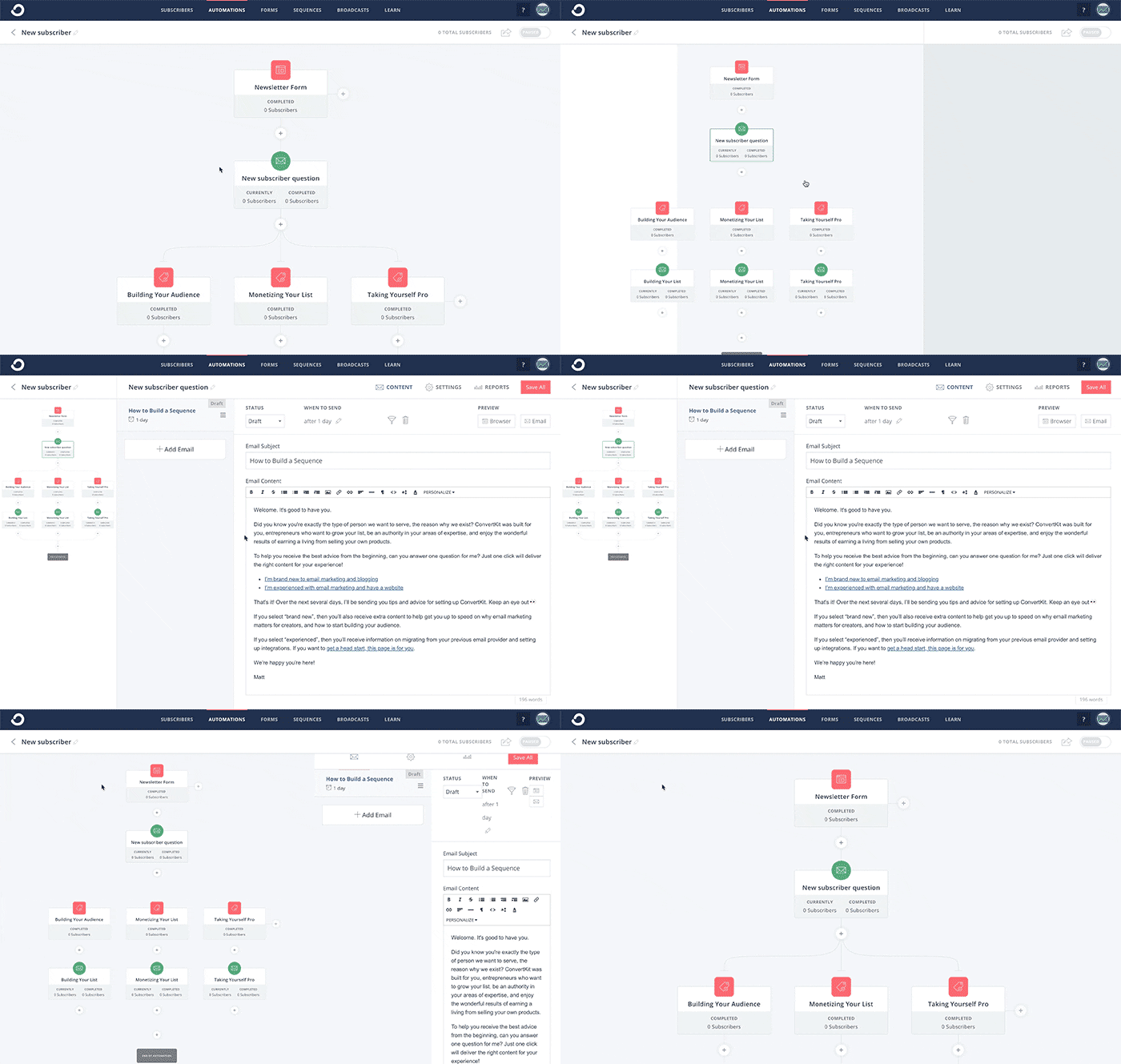
- The speed and interactions inside visual automations
- The speed of our reporting graphs on the subscribers page (and animations)
For example, when you want to edit a form or email sequence in ConvertKit you simply click the item and it loads inline immediately. While obvious now, this is a night and day difference over every other email provider out there.

But then there are a lot of small interactions that lack polish and don’t feel right. They get the job done, but that’s all. Here are a few examples:


- Bulk actions don’t show progress or inform you when they are complete.
- You can’t change the display layout or sort lists of forms, sequences, or automations.
- Forms and sequences are in alphabetical order, automations are by last edited, and broadcasts are ordered by created date.
- Moving between steps of creating a broadcast requires a full page refresh.
- You can’t see which specific subscribers are in a step in an automation.
These are just a few examples of opportunities we have at ConvertKit to change how the product feels. Each one individually isn’t a big deal, but a hundred small things like this change the feeling of our app.
Adding delight
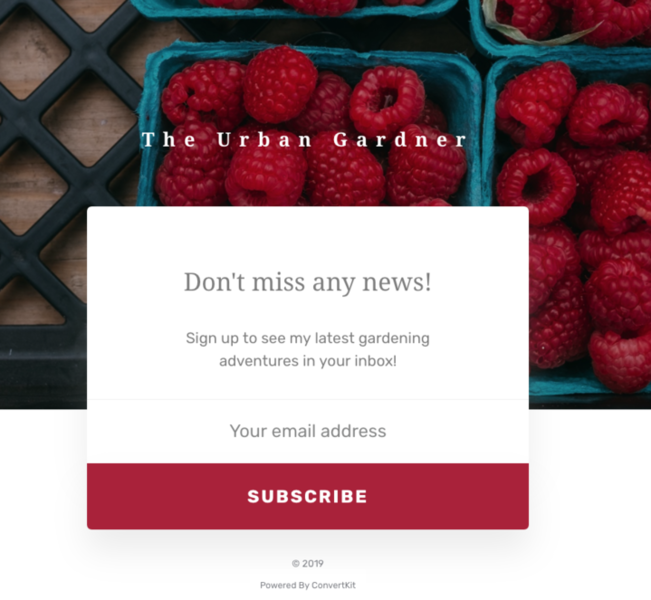
But let’s go beyond fixing the issues and instead add features that delight the user. For example, if our color picker dialog inside landing pages had an eyedropper tool to sample a color from your image, making a great landing page like this would be even faster. Instead of hunting around for a button color, you could just sample the red from the image and adjust from there.

No customer would know to call that out as a feature they valued, but not having it is a tiny vote against the feeling of a perfect user experience.
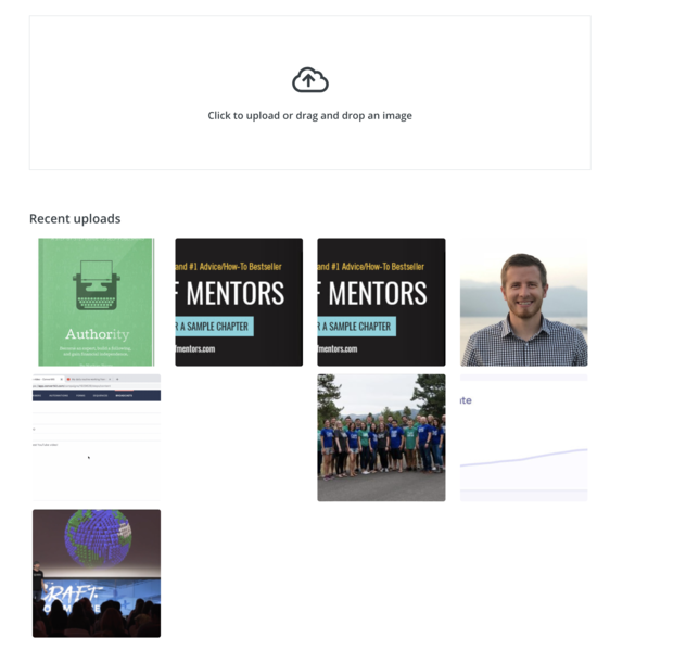
Another feature that we are doing well is the recent image gallery. Going forward many times the image you want (a headshot or logo) will be available in a click, without having to hunt around your desktop for it.

The next steps towards a delightful experience
We’ve built most of the feature set we need to compete well on product, but now we need to continue adding the level of polish and user experience that will bring our product from SMS-level up to iMessage-level.
We’ve nailed some of the big experiences, now it’s time to add the last 20% that will completely change the feeling of the product.
Don’t penalize discovery
As you go on this journey in your own product, the first step is to separate discovering the problem from the work of fixing it.
If you notice an issue and think about how much time and effort you’ll have to spend fixing it, then you’re unlikely to want to add that to your list.
That’s why it is crucial to simply list the issues first—it’s completely fine if you don’t have a solution yet—simply under a “let’s make this interaction better” list.
Take the first step
Go through your product from start to finish, as a user would. Create a todo item for each thing you find. Slow load times, bad animations, confusing interactions, and everything else. Don’t worry about solving it, just make notes.
Then for the next few months just solve one per week. You’ll end up in a remarkably better place.


Leave a Reply