When designing software one goal is to use pre-existing design conventions so that the user can move past the beginner stage very quickly. Though often, if your app is unique or cutting edge, you need to break some known conventions.
Gmail is a great example of this. Labels and conversations go against everything you have learned about email up until this point. You’re telling me an email can be in two places at once? This doesn’t make sense to a user who can’t make the switch from folders, to labels. Even though labels are a far better way of organizing content.
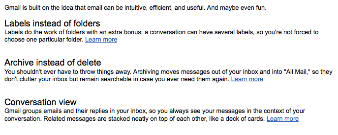
So how does Gmail introduce these groundbreaking and possible confusing conventions? With an email:
They don’t waste any time telling you what is different about their product. It may turn off some users, but they wouldn’t be a great customer anyway. I know plenty of people who hate the conversations feature, and don’t use Gmail because of it. At least this way everyone is clear up front.
Also notice how short the email is, but each concept has a “Learn More” link. Users that get it can move on with the application. Anyone who is confused has an opportunity to get their questions answered.


Leave a Reply