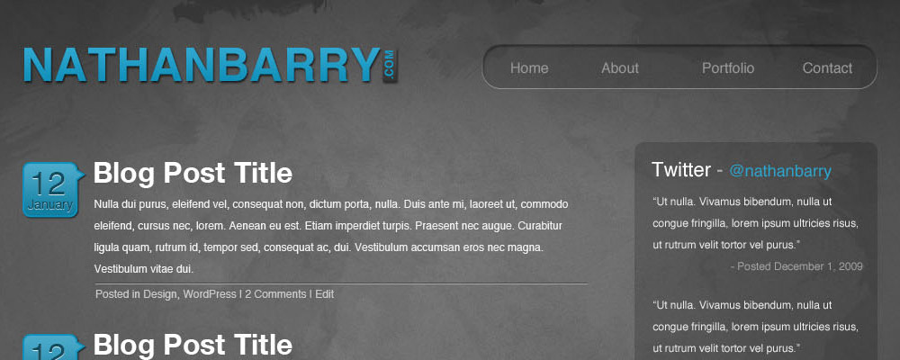
I have the hardest time designing for myself. For some reason being my own client is nearly impossible. For this blog design I have gone through 7 unique designs, before finally making something I am happy with. Take a look: (Click to view full size)
It still needs work, but hopefully within a week or so this blog will be nicely dressed in this look. So, what do you think? I am looking for design feedback so that I can make this the best possible.
Also follow me on Twitter to hear when I launch the design on this site.


Looking reeally good Nathan I love the colour scheme and general layout, very clean with good content placement in my opinion. I look forward to seeing the finished product.
Oh and merry xmas :)
It’s a clean, nice design. I especially like the grunge-esque blog section at the top – it’s bold, yet readable.
The only real complaint is that the white “about me” area doesn’t really seem to match. It looks disjointed in between the two colored halves. Maybe when you get it live it’ll have something to the side to frame it in and make it look more cohesive but in the mock it looks like that area is off.
I look forward to seeing the final mock in action soon. Thanks for all your work on WP Limits I really enjoy it.
Yes, it must be extremely difficult having to design one’s own site ( Theme ) – as you are your own worst critic . However , I love this design ! the color combination is simply perfect as the colors contrast but do not conflict – and I def love the fluid design as well as the sidebar & footer . I was just wondering however : will you be posting thumbpost images ( in case you will be , have you considered creating a nice png background to contain them -such as the one you have created for the sidebar – and also one for blockquotes would be very nice as well :) ) . The theme would then be complete & perfect I believe :D – but overall : tis a beautiful theme :D Best of everything to you !
M.
nice design. the text-shadows are becoming quiet trendy these days. :)
@Roshan It’s true. I scrapped quite a few designs for overuse of text-shadow. It is so hard to not follow trends.
Nice design man. I like the minimalstic and clean design though. Good to be here. Btw im also a newbie designer and ready to roll out my first wp design.
Looks awesome.. The footer is too Good..IMO there should be some space before the logo..
Nathan –
Nice work. Good contrast, so it’s readable – which is the point. I like the three parts – balanced and interesting. Call me and we’ll chat about bios. Best, KK
Looks good Nathan, the design is very nice. However, there are some punctuation/grammatical/spelling errors in your “About Me” section.