The launch of my new course, Photoshop for Interface Design, is coming up in less than a week! Next Tuesday, February 25th, at 11:00 AM Eastern the course will open up to the public. The beta launch was very well received and I used the feedback to make the course considerably better.
I’ve added four new case studies, hours more content, and at least a dozen more short videos. I think you’ll really like it!
A little teaser
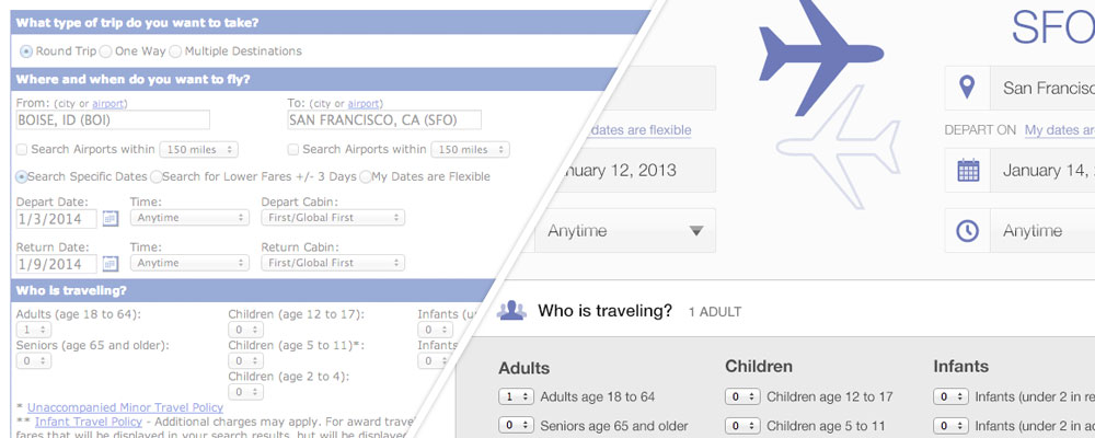
Last week I showed you part one of the United flight search redesign. Today I have part 2 for you. Now this is more of an exercise for learning to design interfaces than it is about a design that United should adopt. Yes, my design is far better than theirs (the bar was pretty low), but there are plenty of design considerations I didn’t have time to take into account.
So watch these videos (starting with part 1) and learn how to use Photoshop to design interfaces.
Video 3
Video 4
Want more updates (and a discount) on the course when it launches? Sign up below. I’ll make sure you get another email on Monday with more details on the course.


Very very informative videos Nathan! Thanks for sharing.
Thank you for a great tutorial! Can’t wait for the full course next week. Here is my version following the tutorial. Not happy with the multiple destinations icon but overall I was quite pleased with the way this turned out.
https://drive.google.com/file/d/0B_UecyN24YPqT2JSSDlVV3R1R28/edit?usp=sharing
Fantastic videos. Absolutely love them!
One question about United’s design and one of the problems I have with it.
Wouldn’t it be easier and more streamlined to have a drop down menu for the a) amount and then a second one with b) age.
You could also have a little plus to add more people. I don’t know. Might just be more work, but it seemed to me like that would perhaps be a better space saver and just easier to do when signing up for your flight.
Nathan,
As always love your work. I’m not a designer, but enjoy following your marketing thoughts. So thank you, for being transparent and just plain old “trying stuff.” On this design above, i caught myself looking at it, and as parent of a young family, the one thing that stood out about your redesign, was that it felt way more “family friendly.” Not only was it easier to use, but with the children and infant sections being more visible, indirectly it made me think of United as being a more family friendly option. It still serves the needs of the main principle income driver, ie the business traveller, but that small change made it assessable and more friendly to the average joe. Just a quick pondering from my brain. Thanks for your content!
I wish you had a dozen of these exactly like it. Very educational for me. I watched them twice already! haha :p
That was such a great suggestion I decided to create an entire course with dozens of videos!
http://nathanbarry.com/photoshop
What do you think?