About Fluent
Fluent is a new memory system app I recently wrote for the iPhone. It is a twist on the traditional flash cards application in that it has a system to ensure you learn every card you add. For me Fluent is significant because it is the first iOS app I have written entirely on my own. Without having to hire out any of the development. One more milestone met on my journey to become a programmer.
To learn more about Fluent you can view Fluent on the App Store.
Guidelines
I started with a few guidelines to shape the process:
- Build the app I want to use. Many people have asked for more features, Fluent to function a different way, or some other change, but if it doesn’t fit with the app I want to use then I don’t include it. Hopefully a few other people will share my vision for a memory sustem application like Fluent.
- Release as soon as possible. I focused on what I felt was the minimum necessary to launch and nothing more. I could have spent months or years tweaking the code and design before feeling like Fluent was complete, but instead I decided to release it quickly. Since it is a side project I needed it to have a feeling of completion so I could move on to something else. Many features are missing, but it is still an application that I will use every day.
- Be able to review cards immediately after launch. Launch the app, review flash cards. Once the cards are loaded that is the workflow. No need to worry about what you should be reviewing that day or navigating screens to find the right cards. I wanted to be able to stand in line at the grocery store and quickly review French vocabulary.
The interface
Wireframes
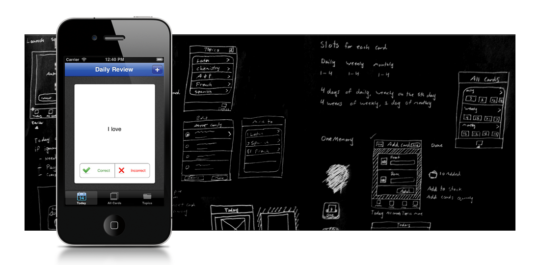
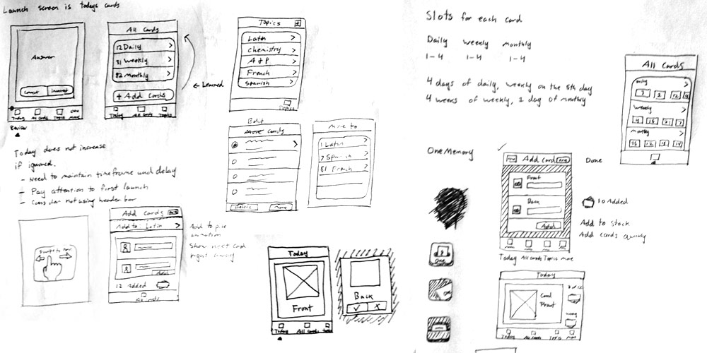
I start every project with sketches. As you can see above they aren’t very detailed or even very good. But the important thing is that they convey the ideas of the application. Each thumbnail is accompanied by notes about features and design elements I want to include. I even sketch out icon ideas and try names. Whatever comes to mind I put it on paper.
Version 1

The first design direction helped get the screens figured out and a better feel for the application. But ultimately I didn’t like where the design was headed so I scrapped it and went in a different direction.
Version 2
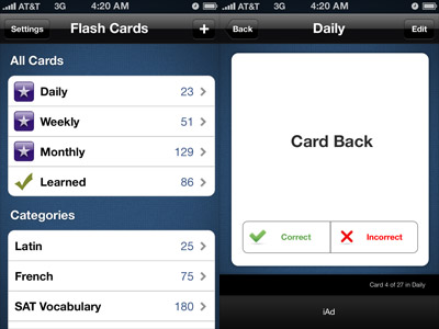
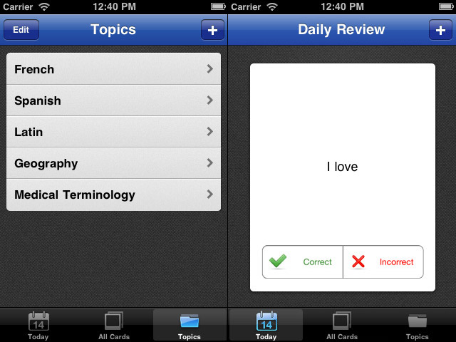
The next version started around a blue color and a dark fabric texture. They looked really good together and I designed the rest of the style around those two elements. The application was better organized by using a tab bar to move between sections.
When I first start designing a simple application like Fluent I always underestimate how many screens are required to fulfill the features, especially on devices with small screens. That was very true with Fluent. What I originally thought would have 3-4 views ended up with 12.
Everything in this version is more precise and focus is drawn to the most important elements.
The Icon
App icons should meet a few basic requirements: communicate application purpose, stand out in a crowded store, match the style of app, and look excellent. I tried a lot of different concepts (a few sketches shown with the wireframes), before I decided to go with a basic shape. I’d like to give credit to whatever inspired the shape, but I can’t find the source (maybe it was original). Though the color wheel idea comes from Kaleidoscope by Sofa.
![]()
This icon meets all the requirements except for conveying the application’s purpose. Oh well, I guess I can’t insist on having everything. To me it represents fluid, continuous, and dynamic.
The Name
I hate naming products. Though I am really happy with the names of my products (OneMotion, OneVoice, and now Fluent), I didn’t come up with them. David Wheeler named OneMotion, and I named OneVoice to match that style he had already setup. At first this project was just called “Flash Cards App.” Then in keeping with the previous style I started calling it OneMemory. Not great, but I thought it was good enough to launch.
OneMemory stuck until my mom came over for dinner one evening (the memory system is based on something she created years ago). Though she was thrilled to see that her ideas were going to be available for so many more people to use, she hated the name. Dinner conversation moved on to other topics as she was quiet for a few minutes.
“Why don’t you call it Fluent?” she said. “It’s short, simple, and it implies mastery of the topic.”
Wow, great name, but I never thought it would be available. Amazingly enough the name was available on the App Store. 500,000 applications and no one had taken the name Fluent. Cool.
That’s it. If you are interested Fluent is now available on the App Store for $1.99.


Leave a Reply