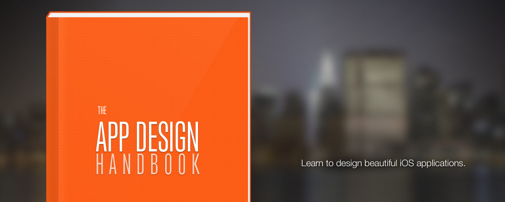
I am thrilled to finally announce my latest project: The App Design Handbook. A brand new guide packed full of everything you need to know to start designing iOS applications. The book itself will be a digital release, with additional resources included (videos, Photoshop files, and sample projects).
Signup to be the first to know when it is released »
Leading up to the release I will be releasing a lot more articles, tutorials, and videos. To kick that off you can watch me design the book landing page in 3 minutes (8x the normal speed). Click the link above to see the final landing page (and signup).
The Timelapse
Check back soon for future videos including a tutorial to design and code that exact page. I really appreciate your support as I launch the book. So please share with anyone who might be interested.
P.S. If you need your fix for App Design tips and can’t wait for the book to come out, signup for my iOS Design Newsletter.


I’ll be on pins and needles until it’s released!
Nicely done. I love this idea, but the issue I have is there’s no showing of why these elements are on the page, what thought you got there. Nor any examples of using grids, or any other page hierarchal structure.
This is pretty, very pretty. But design is reason, not beauty.
Congrats on launching :)
Thanks. For a page this simple I didn’t see the need to use grids or any other design guides. I would on a more complex site (especially with a lot of content). Really there are only a couple elements on a simple page.