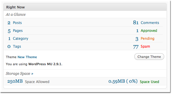
In the WP UI group we are currently discussing how to improve the “At a Glance” module on the dashboard to make it more clear. The problem is that comments is not differentiated at all from the rest of the sections so users tend to think that “Pending” relates to “Categories”. This can be seen in the current UI below.

My Solution
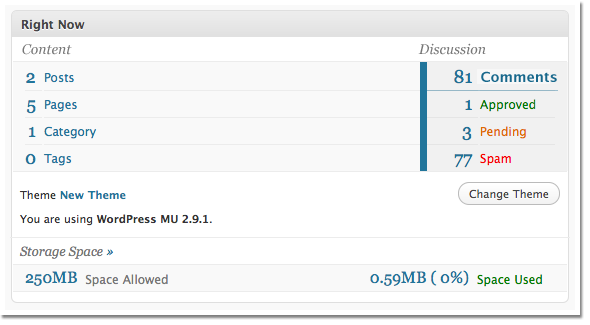
My solution is to group the all the comment related numbers visually. They are already grouped by placement, but in this case, with the strong horizontal lines, that isn’t enough to set them apart. Also we need to show hierarchy since the main comments number (88) is the total of the other three numbers.
Though I don’t think this is perfect visually, it adds much more differentiation between the comments group and the rest of the content. Let me know what you think and get involved with the discussion here on the WordPress UI blog.


[…] ce que propose Nathan Barry, afin de mieux présenter les informations disponibles. Qu’en pensez-vous […]