How is it that some software lets you accomplish just as much as competing software, all while maintaining a much simpler interface? Basecamp, by 37signals, is a great example. With just a few features—each with a simple interface—you can complete all the same tasks as more complicated project management applications.
Ryan Singer from 37signals introduced me to an idea that he calls “judo,” for radically simplifying interfaces for a particular feature.
Introducing Judo
Let me use one of Ryan’s examples to show you what I mean:
I was working on an app that was related to doing memberships, and we had the idea that we should have some kind of detailed model to track if they had been given a gift in return for their membership. If it was a gift, like let’s say it was a T-shirt, we would want to know what size they are, so that next time we give them a T-shirt, we give them the right size, and stuff like that. And the data model was getting really complicated with all these attributes, so we decided, how about instead of all that modeling we just put a text area? And then you can add additional notes any time something happens.
A single text area replaced a huge number of fields and a complicated data model. Now, it isn’t without tradeoffs, as Ryan goes on to explain:
And the upside of that is it’s really flexible, and will handle any kind of case we want. And we can build it in 10 minutes. Of course we’re not going to be able to query to see how many people have a size small shirt so that we can order the right number of small shirts, right? It’s really about the simplifying stroke, this idea of Judo, and what is the momentum of the situation, and make one simple design decision that just massively simplifies the problem.
Ryan saved three to four weeks of development time on the project by making that simple change. That sounds pretty good, right?
Judo in practice
The concept can be applied in so many ways that I want to take you through a few examples so that you can see the range of what is possible.
Gumroad, my favorite payment provider, allows pay-what-you-want pricing. When enabled, a buyer is presented with a field to enter how much they want to pay. The seller can also set a minimum price for product. So it becomes “pay any price so long as it is at least $x.”
How would you design the interface for this? Here’s one (slightly contrived) option:
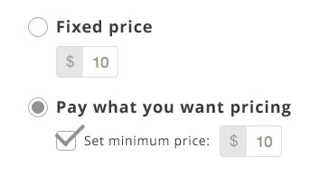
The seller uses radio buttons to select the type of pricing, then has the option to select a minimum price. You could use animations to only show the minimum price if “Pay what you want” is selected. Let’s see what this could look like when you use some UI judo:

See what’s different? They just let you add a + into the price field. To let the buyer pay any price you would enter “0+” and if you want to set a minimum price just enter “20+” or whatever your minimum price is. So much better. If things need to be more clear you could add a tooltip explaining the options that only displays when the price field has :focus.
Gumroad has another simple feature that I really like. On the sales page for each product there is a line that says “You get ______” the blank is filled in with “an MP3”, “a PDF”, or whatever else you uploaded. That’s nice information to provide to the buyer, but what if the files are bundled in a zip? So then a bundle of MP3s is listed as “a ZIP.”
The Gumroad team thought of a way to unzip the package on the server and programmatically determine the contents. At least then it could return “12 MP3s” or something more descriptive. But that’s hard to do.

The “judo” solution is to make the blank a user-editable field. It defaults to what has been uploaded, but lets the seller change it inline. Sellers have customized this to say things like “12 awesome songs” or “a ZIP plus a smile.” Letting the sellers personalize the message adds a human element—and makes programming much easier.
Additional examples
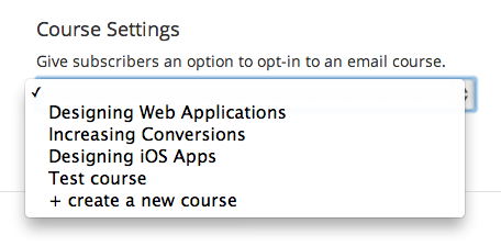
I encounter over-complicated interfaces in my own designs quite often. A recent case was when designing the interface that allows subscribers in ConvertKit to be added to a course. At first I had this design:

But after a little thinking I was able to cut the number of elements in half (removing the checkbox) by adding a blank or no course option to the select menu:
The time tracking application Freckle has a very clean time entry form at the top of the page. The interface will let you type in your client name and will autocomplete with the most likely options. But instead of returning “no results” for a new client, it offers to create one on the spot:

That means I can track time and create a brand new client all in a single form. Pretty slick!
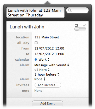
Fantastical for Mac allows you to enter your event details in sentence format and automatically fills in the rest of the details. So typing “Lunch on Thursday with Nathan” creates an event at noon. When you include the address, that one input field does the job of an entire form!
Thanks to Dave Stevenson and Nathan Clark for pointing out the awesome features in Fantastical.
Applying judo
Ask yourself, what are the fewest interface elements that allow the user to complete this task?
Cutting too many UI elements may complicate the problem and not be the right solution, but designing the most minimal solution will show you new methods you wouldn’t have thought possible before.
Keep learning
If you enjoyed this article, you’ll love my book Designing Web Applications. I go into detail on many more topics that will help you design great web apps. Also included are the interviews where I got many of these ideas. You can learn from designers like Sahil Lavingia (Gumroad), Ryan Singer (37signals), and Trent Walton (Paravel).
Learn more about Designing Web Applications »
I also have a free 30 day course on designing better web applications. Sign up below to get the first installment of the course tomorrow.


While some of these techniques can simplify development time, you will sacrifice query-able data from your database. (As Ryan pointed out with his t-shirt example)
Maybe Judo is better suited for helping get your application out there. Once you adopt a user base, you can spend the extra time with UI elements/data collection that allows you to get more detailed data.
In each of the examples after Ryan’s, you still have data you can query — price, email preference, client name. In certain cases (eg, text fields) you’ll lose structured data, but not in these examples.
If your format the data with querying in mind you can create unique attributes within the text field that can be searched for. What if you labeled all shirt sizes with ‘SIZE=’ before the size? Then you could query for ‘%size=M%’ to find everyone with a size medium, etc. By thinking one step ahead your dumb text area, becomes a readable, searchable field.
One example of this in practice is the way WordPress saves settings for plugins and themes. The wp_options table is setup to handle option_name and option_value as a text field. Developers use the options_value field to save delimited text strings so that you can save many settings in one field. It’s not the most readable format, but it works. And it powers all the functionality of plugins and themes across all of WordPress!
If you have ever worked with large amounts of enterprise data (10 million+ rows) from a query perspective, having Text fields pre-fixed with a tag becomes wasteful and not very performance friendly. Also – key/value tables are an option into you have to cross-tab the results and then performance becomes a big bottleneck. Source: Developer for +18 years.
That being said – smaller amounts of data you can probably get away with these techniques without too much issue. Anyway most of our apps will never have that much data.
Everything is a tradeoff ;)
(I’m the co-founder of Freckle.) We’re also using simplification of forms in other places in Freckle. For example, the “TIME” field you can see in the screenshot takes values like “9-5” or even “3/4 4” for 4 hours on March 4 (so you don’t have to click the calendar).
This doesn’t necessarily mean it’s less work to implement. Writing parsing code can be complex, and going beyond what your framework might assume can be tricky. Heavily customized or written-from-scratch user interface elements are time-consuming to test, especially when you need to do cross-browser testing. Our motivation is providing the best user interface—something users can work with and which gets out of their way. There’s thousands of lines of code supporting the simplicity of our time input form.
You can bring this to its logical conclusion: remove forms altogether. For example, instead of asking the user for their time zone, just sniff it with JavaScript, and report it back to the server with an Ajax call in the background. It won’t be 100% accurate (JavaScript doesn’t report the time zone, but only the UTC offset), but for most applications that’s good enough.
Thomas, thanks for commenting. You are absolutely right that often the simplest thing for the user interface is more difficult to code on the backend. I love the little things you’ve added to Freckle to make a great user experience.
Regarding 37signals:
Just have a look at their free ebook “getting real”, you can download it on their website.
They are also discussing these things :-)
Thanks for the post (and for showing me Trump Gothic font; LOVE IT)