
There’s never a shortage of blog posts to read, so how do you decide which ones are worth your time and which to ignore? I always try to read high quality, well thought out articles and tend to skip the blog posts that look hastily slapped together.
Good graphics will go a long way towards making a blog post look interesting and high quality. Today I want to show you how to create graphics that make people want to read and share your work.
Prerequisite: finding good photos
Not all of my techniques require photos, but they are the easiest starting point for unique, high quality graphics. Let’s talk about where you can find good photos. There are tons of sources, but let’s focus on just three (you can suggest more in the comments).
FreeImages.com
I’ve used this site for nearly a decade. It used to be called sxc.hu, but they’ve just rebranded with a more user friendly name. Create an account and then you can search and download thousands of high quality images.
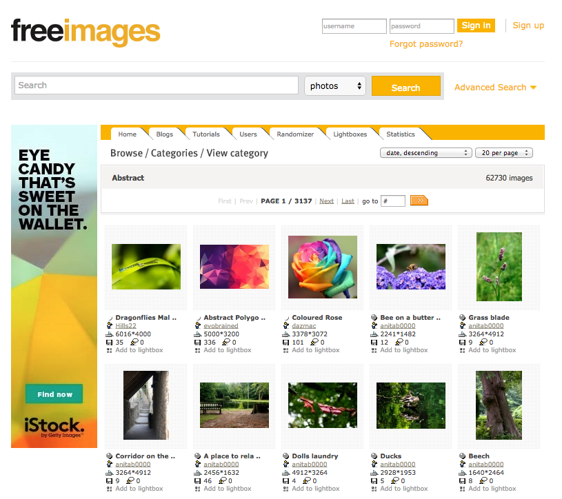
I like to browse through the Abstract category to see get a random selection of photos.
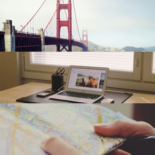
Unsplash
Unsplash is a collection of completely free (you don’t even need to attribute the photographer) photos. They release a new bundle of 10 photos every 10 days. And the quality is fantastic! The only issue is that there are now so many amazing photos that it is hard to find exactly what you are looking for. My solution is to scroll quickly through the site (it has infinite scrolling) and open each new photo in a new tab. Here are three random photos from Unsplash:
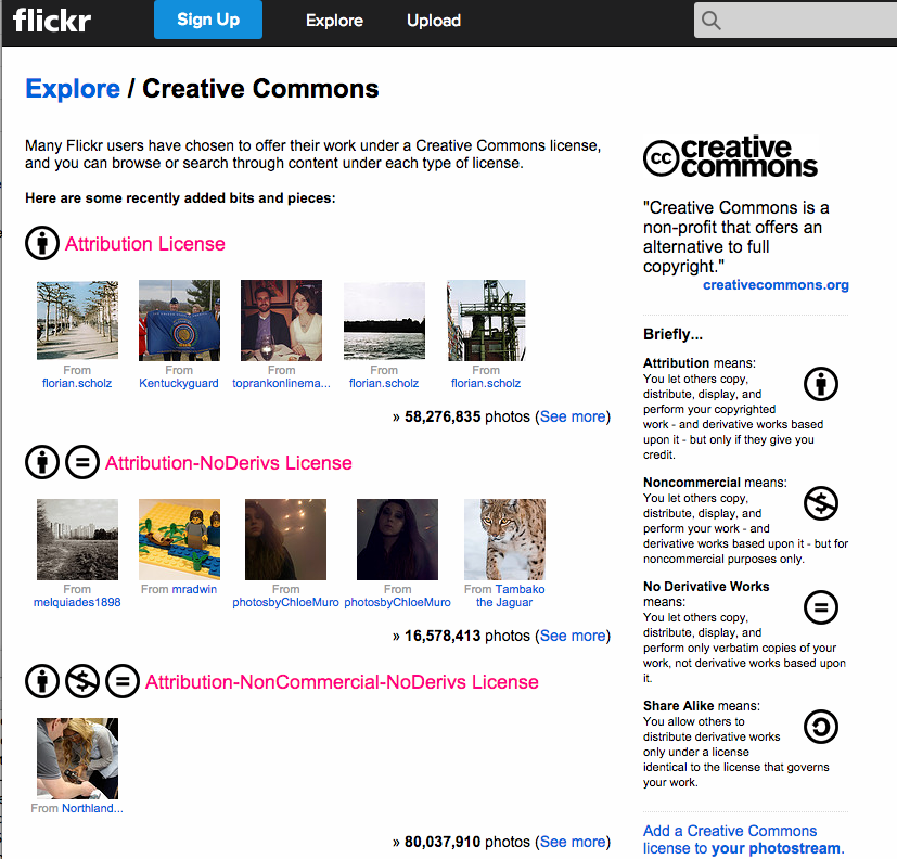
Flickr Creative Commons
If you need something more specific, Flickr Creative Commons search has been my go-to place for years. When doing an advanced search you can specify what licenses you want to search within. In most cases you need to attribute the photographer, but that’s easy with a simple text link.
1. Adding color + detail
A photo will add a lot to any blog post, but anybody can use the sites I mentioned above to get one, so you’ll have to take a couple of extra steps if you want your image to stand out.
Here’s a short video tutorial on how to turn a good, but very common, photo into something unique to your site.
2. Icons
My next go-to method is to add icons. You can create simple, effective graphics just by adding a few simple icons to it. This image was for a post about how content combined with marketing automation can lead to new clients. Originally I was going to design something fancy to illustrate the point, but then I realized I could get a similar effect in five minutes if I used three free icons.

For the graphics within the post I used icons from The Noun Project to represent each season. This explains at a glance the concept that took a few paragraphs to explain with text in the original post.
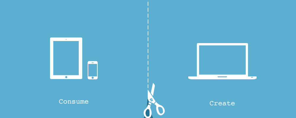
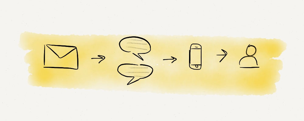
And finally, here’s one more basic illustration made entirely with free icons for my post on creating and consuming content on different devices:
3. Photos + Icons
To take your images to the next level, tell a new story with your photos by combining them with icons.
4. Making text interesting
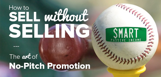
It’s often tempting to write your post title into the image itself. That’s fine, but only if you do something interesting with it. Pat Flynn does a great job with that on his blog. Notice how he lays two fonts creatively on top of a relevant photo. Just be careful with this; if you screw it up, it looks really bad.
A combination of fonts (and a fancy ampersand) helped make this image for a workshop Brennan Dunn and I taught seem much more interesting. Note how we’ve applied all the techniques we’ve talked about up to this point to this image:

Using color
The easiest thing to do is simply add some color. Ideally, you should use a color that matches your image. Here’s a simple tutorial in which I’ll also show you how to add a shadow detail to the text:
Shapes and lines
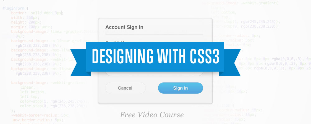
The next technique is to add simple shapes and lines to make your text more interesting. That’s what I did for this ‘designing with CSS3’ post. The simple blue banner really makes the post title stand out.
Combining a photo with some fancier text designs can make a great background. Here’s a brief tutorial:
5. Sketched
Some of my favorite design styles are handwritten and organic. You could try to create that look with special fonts and textures, but there’s often nothing better than just going old-school and using a pen and paper. That’s exactly what Sean McCabe does here, with what could be an entire blog post in a single page of his notebook:
Now if you’re a little intimidated, don’t feel bad. Sean’s a pro. You can start much simpler with more basic techniques.
Note cards
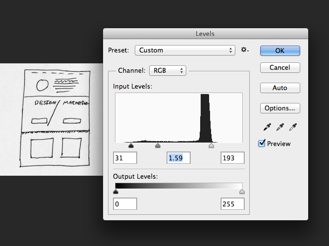
Last July at WDS I was hanging out with my good friend James Clear for an impromptu work session. He wanted simple graphics for his blog, and his current tools were a pen and little 3×5 note cards. He’d sketch out a simple illustration for his post, then take a photo with his iPhone (the trick is to not cast shadows on the paper).
Then you’d bring the photo into Photoshop and use Levels to make the background white.
From there you can use the darken blend mode to put the pen drawing on any color background.
Adding color
This worked well for James and he used it in a few posts, but he wanted to add a little more to each image. So I suggested adding color with some simple brushes. We bought a copy of Kyle Webster’s brushes (who was randomly about 2 blocks away at another conference at that exact moment) and added some color.
Here are a few of the simple graphics James drew using the technique:
These are clean and simple, while still feeling organic. These do a great job of illustrating a point and breaking up what would otherwise be a massive block of text.
6. Organic, without getting your hands dirty
Now some of you may be complaining about having to interact with something in the real world. After all, it’s dangerous out there. Ink stains and paper cuts are just two of many possible risks you face by stepping away from the computer.
If that’s you, I’ve got another technique for you. You’ve got an iPad, right? Good. Download Paper by 53. This drawing app provides natural feeling brushes and a graphics rendering that will smooth out your poorly drawn lines, and it makes you look far more talented than you actually are.
Here are a few graphics that I made for my own blog posts:
Don’t I look talented? …don’t answer that.
7. Quotes and Tweetables
Sometimes you say something so smart that you want to make sure everyone reads it. You can pull that out into a little graphic to show off just how intelligent your ideas really are.
Josh Pigford from Baremetrics does a great job with these:

I’m always trying to be as cool as Josh, so I designed a few quotes for my own blog posts. Josh may be clever, but he’s not as clever as my dear friend Oscar Wilde. Plus, I recorded each of these design sessions so you can learn how to do it yourself!
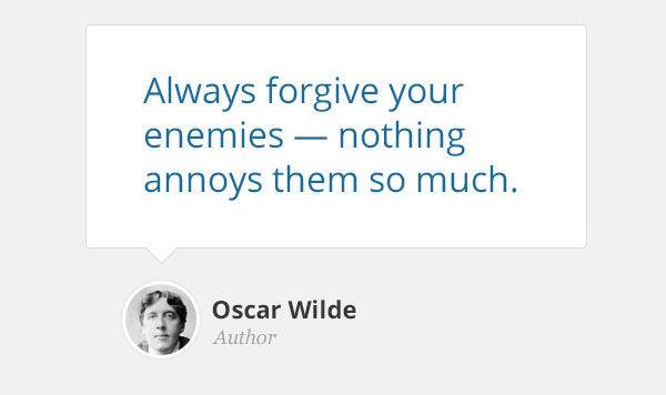
Basic quote
Just the minimum to make a nice pull quote.
Paper quote
Add some interesting colors and textures to create a new look.
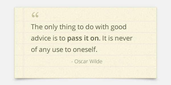
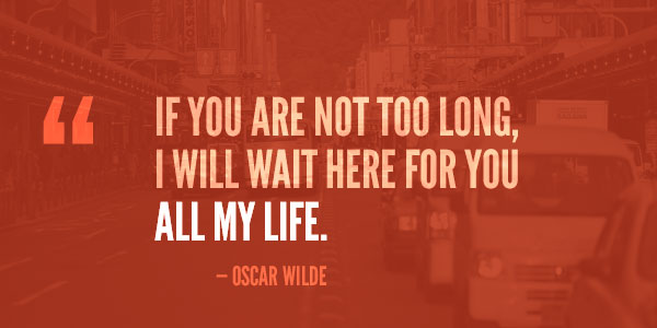
Photo quote
Using techniques from earlier in the post we can turn any photo into a great quote background.
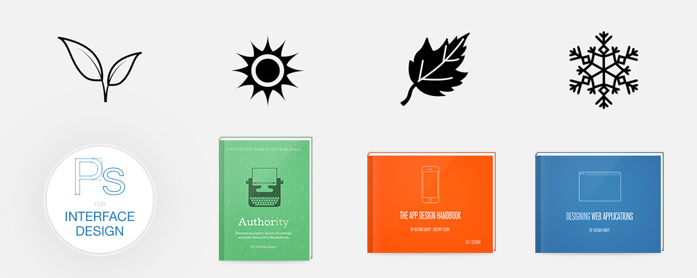
Photoshop for Web Design
Over the last year I’ve been working on a course called Photoshop for Interface Design. Recently I added a bunch more content on how to design blog graphics, sales pages, and more so that it is focused not just on designing software interfaces, but also on web design itself.
If you’ve ever tried to learn Photoshop and been frustrated with all the useless tutorials and training focused on photographers, this is the course for you! I cut through all the features in Photoshop that don’t matter for web and app designers and focus entirely on the skills you actually need.
The updated course launches on September 23rd. You can learn more and get on the waiting list here: Photoshop for Web Design.
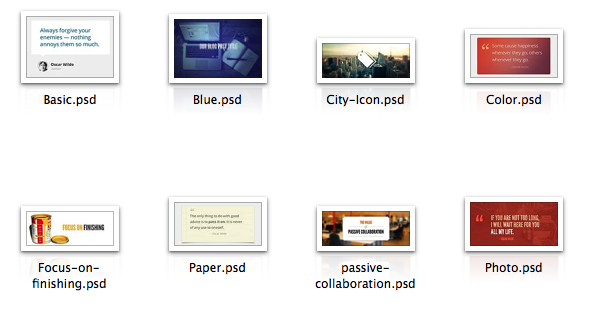
Get all the PSDs for free
If you want to customize any of the graphics we put in today’s article, you’re in luck! I put together a zip file that includes all the Photoshop files. Download them, customize them, and use them in your own posts!


This is absolutely incredible Nathan!
Can’t thank you enough for this post dude!
I was looking at doing images like James has, what brushes would you recommend we get from Kyle T to start with and do we need to use a digital pen/wacoom with them?
Thanks again!
Dean I would recommend just buying the Pencil for the 53 app….its great and gives you access to all the tools in the app. The app is great.
And phenomenal post Nathan! Thanks for all the great resources.
Wish I could Mike,
I don’t have an iPad though man :(
Thanks Nathan.
Now I know what to do with all my hand-drawn stuff :)
Thanks a lot man.
CJ
Canva.com will save you a bunch of time as well. They make creating these types of graphics easy for mere mortals like myself.
I like this post a lot very good article..I am currently in a debacle with a domain squatter kinda lost my blog domain … long story but anyways..Im unraveling that it cost money to even get icann involved apparently you have to pay WIPO a 3rd party organization to basically enforce the law. But I think this all highly illegal and was wandering if you could do a blog post on the tpic. Id be more than happy to be a case study or one of the victims you interview lol.
Very informative Nathan! The best “high quality, well thought out” post in my inbox today by far.
Thanks for the cool tips Nathan, can’t wait to try the paper app to create some of the cool painterly look. Love tip #5 & 6, the old school pen and paper scanned and colored with the darken blend mode was a similar process we used to color cartoon greeting cards back in the day. Great tips!
Nathan, you are a Photoshop master. I think I’m quite handy with Photoshop, and I use it everyday to design blog graphics. But watching you in these tutorials gives me tips and tricks that have baffled me for years. Literally years.
Thanks a ton for putting this content up, you’ve got me hooked. I’m now going to tell everyone that I know how much of a badass you are.
Fantastic info, Nathan!
Thanks so much for sharing these tips and techniques. I’m feeling motivated again :)
amazing!
That’s great how you show how to add the BOOM to existing images! A lot of people feel they need great images and don’t realize that some filters and nice fonts can turn ordinary into extraordinary.
Sharing this! thanks Nathan
This is awesome Nathan, especially for non-designers like me.
Thank you so much for creating this tutorial :)
Awesome post, really helps to see those blog post images see differently and make them awesome! :)
This is a lovely piece Nathan. I’m sorry you took three days on it, but I like what you’ve done and I think there’s a full course in this topic.
This is incredibly useful. Great images are definitely something that make blog posts stand out but it feels like such an intimidating thing to tackle when you’re not a designer. I feel like I’m actually going to be able to put this advice into action.
Fantastic info which has your usual step by step leave nothing style.
Really appreciate you taking the 3 days to putting this together and not giving up!
Super post, Nathan!
In case you haven’t used it, check out compfight.com which is a Flickr search tool and it has sped up the time I spend looking for images (which can be time-consuming).
Thanks Nathan!
An addition for good photos: http://www.pexels.com/ and http://thestocks.im/ let you search free high quality images on photo sites like unsplash (There are a lot of similar sites).
Nathan, this is great. Some great resources and tutorials here.
Great timing, just when I was looking for a little inspiration.
Thanks
This post was so helpful! I’ve been using photoshop forever but still didn’t know some of those shortcuts. I already created a fun new image for my blog using the blurred edges with a layer mask. Thanks :)
Hello Nathan!
Thank you very much for your post, it’s very nice and helpful.
Just in case you didn’t noticed, all of your videos are hidden in YouTube. You may want to make them public to get more views. Just my 2 cents!
Was that on purpose?
Nice blog!
Thanks for the tips!
Fabricio
Nathan,
Thanks for taking the time to put this together. These are great suggestions!
I’m a big fan of freeimages.com as well. For icons I really like Font Awesome: http://fortawesome.github.io/Font-Awesome/
Tom
A question from a complete web novice working on 1st site:
Do you take into account file size when adding graphics to a post?
I have found some beautiful photos at Unsplash and Gratisography – however, the file sizes are huge and even after compressing them my page loads slowly.
Any advice generally on managing file size would be great.
Thanks for the article – useful to people in my situation.
Cheers.
Beyond excellent post, Nathan! I can see why it took 3 days to put together, there is so much fabulous content. Thanks very much!
Pam
Thanks for this! One question: in the “Using Color” video, where you add a shadow to the text, I notice it doesn’t match the direction of the shadow present in the graphic – does that matter? (I probably wouldn’t have noticed it had this not been a tutorial video)
Thanks again for great tips!
Wow! This post was amazing. It was simple and to the point but was chocked full of just fantastic material to consume! I love how you use the PSD files at the end as a lead magnet! GENIUS! Have you ever thought about doing some of your tutorials in PIXLR? A lot fo people can’t afford Photoshop. Just curious?
Thanks so much for this post! It answered all my questions about designing images for blog posts and has some really great links.
Seriously great post. Thank you so much for the inspiration.
I love these tips! I’ve been working through ALL my old posts and updating links and adding pinnable images. It’s a huge amount of work, but I’m eating that elephant — one bite at a time!
Are you using a plug-in for your top ten posts? If so, mind sharing what it is?
Thank you so much! I’m a new blogger and I LOVE the hand drawn and simple stuff. I want to draw my own. It’d be fun and honestly way cheaper.
Thankyou… useful information.
It’s Great Techniques man I would like to apply it in my next work Thanks.
Awesome post! I’m using all these approaches on my blog posts. Thank you for sharing!